December 30, 2010

An Evening with Python's itertool module

Why I love Python? Well, have you been to Himalayas and have watched the morning sunrise? There are certain feelings that cannot be explained. The fun of programming in python cannot be compared. Anywayz...more on Python and the associated 'joyness factor' in a later post. :)

Often while working with large datasets with Python, one needs to take extra care of the memory and even the simplest of the programs have the potential to make the system go slow and consume the entire memory. Python itertools module has some nifty functions which you will end up using most of the time while working with large data sets, especially when working with text. I spent sometime playing around with some basic functions in the itertools module which are simple to use and often find usage across various functionalities. Though the python docs do a pretty fine job of explaining the individual itertools functions, this post is just an enumeration of a few handpicked functions that I often use.

The following snippet does a quick bigram and trigram generation of a given line:
from itertools import *
def bigram(line):
  words = line.split()
  for i in izip(words,words[1:]):
    print i
def trigram(line):
  words = line.split()
  for i in izip(words,words[1:],words[2:]):
    print i

sentence = "Python is the coolest language"
bigram(sentence)
trigram(sentence)
If you notice , 'language' is not part of an empty tuple. If you want to fill the last tuple with a default value, use 'izip_longest'
for i in izip_longest(words,words[1:],fillvalue='-'):
  print i
A sentence can have many non-alphabetic characters, 'filter' does a quick job of removing them. It takes a function as an argument and a list. The function is applied on individual elements of the list.
print filter(str.isalpha,words)
'imap' would probably be one of the most jazziest and coolest of the itertools functions. Lets see its usage in the following example. Assume that you want to find out the longest word in a given file which contains a word list. What is the 'conventional' way of doing this?
infile = open('words.txt', 'r')
len_longest_word = 0
while 1:
  word=infile.readline()
  if not word:
    break
  tmp_len = len(word)
  if tmp_len > len_longest_word :
    len_longest_word = tmp_len
print 'len_longest_word :',len_longest_word
infile.close()
 The same when done via imap is just one sentence :) ..as follows. (note : we are reading the entire file in one go).
infile = open('words.txt', 'r')
contents = infile.read()
words = contents.split()
print "len_longest_word:",max(imap(len, words))
infile.close()
Now, lets say we have to analyse the frequency distribution of a few lists or lets say we have to process a group of lists by accessing successive elements, then the following is a very simple and neat way of acheiving this. (Try doing a frequency distribution of n lists containing numbers using 'chain')
from itertools import chain
a=[10,20,30]
b=[100,200,300]
for i in chain(a,b):
  print i
Often, we want to group elements in a dictionary by its values; instead of iterating through the dictionary and writing redundant code, itertools comes with a cool 'groupby' which allows us to specify the dimension in which we want to group.
from operator import itemgetter
d = dict(a=1, b=2, c=1, d=2, e=1, f=2, g=3)
di = sorted(d.iteritems(), key=itemgetter(1))
for k, g in groupby(di, key=itemgetter(1)):
    print k, map(itemgetter(0), g)
 The above example on groupby was obtained from here.

December 25, 2010

Facebook Features for 2011

Facebook has been one of the biggest happenings on the web which caters to audience of all age groups. Though Facebook will continue to innovate and launch new features, along with fine tuning their software infrastructure, i would expect(kinda predict) the following features for 2011 :
  •   Automatic tagging of pictures - face recognition
  •   A better friends recommendation system
  •   Sentiment analysis of status updates - show a suitable emoticon based on sentiment
  •   Event recommendations - from what people in your network have been attending
  •   Smarter text input system - some form of auto-complete feature?
  •   "Interesting" factor - for eg. pictures (and hence compete with Flickr Explored)
  •   Marketplace - compete directly with eBay and gain some market share
  •   Messages - can this overtake GMail? (i am not sure; dont think so too )
  •   A good RSS feed aggregator/reader
  •   Some more tweaks to the profile page
  •   Better games 
  •   Location based apps
  •   Some integration with the Enterprise?
  •   Tackle Privacy concerns that comes as part of capturing user content
I would expect a couple of distruptive changes too, which makes Facebook a 'clear' leader in social networking.

    December 24, 2010

    Python Huntington Hill method

    The following python code implements the Huntington Hill method which was used to generate the apportionment details in my previous post.

    import math
    
    def huntington_hill(popln,num_seats):
      num_states = len(popln)
      representatives = [1]*num_seats
      std_divs = [math.sqrt(2)]*num_states
      for j in range(num_states,num_seats):
        max = 0
        for i in range(1,num_states):
          if (popln[i][1]/std_divs[i]) > (popln[max][1]/std_divs[max]):
            max = i        
        representatives[max] +=  1    
        std_divs[max]=math.sqrt(representatives[max] * (representatives[max]+1))
      return representatives
      
      
    POPULATION= [("JAMMU & KASHMIR",10143700),("HIMACHAL PRADESH",6077900),("PUNJAB",24358999),
    ("CHANDIGARH",900635),("UTTARANCHAL",8489349),("HARYANA",21144564),("DELHI",13850507),
    ("RAJASTHAN",56507188),("UTTAR PRADESH",166197921),("BIHAR",82998509),
    ("SIKKIM",540851),("ARUNACHAL PRADESH",1097968),("NAGALAND",1990036),
    ("MANIPUR",2166788),("MIZORAM",888573),("TRIPURA",3199203),
    ("MEGHALAYA",2318822),("ASSAM",26655528),("WEST BENGAL",80176197),
    ("JHARKHAND",26945829),("ORISSA",36804660),("CHHATTISGARH",20833803),
    ("MADHYA PRADESH",60348023),("GUJARAT",50671017),("DAMAN & DIU",158204),
    ("DADRA & NAGAR HAVELI",220490),("MAHARASHTRA",96878627),("ANDHRA PRADESH",76210007),
    ("KARNATAKA",52850562),("GOA",1347668),("LAKSHADWEEP",60650),
    ("KERALA",31841374),("TAMIL NADU",62405679),("PONDICHERRY",974345),
    ("ANDAMAN & NICOBAR ISLANDS",356152)
    ]
    
    NUMBER_SEATS= 545
    
    mps = huntington_hill(POPULATION,NUMBER_SEATS)
    for i in range(len(POPULATION)):
      print POPULATION[i][0]+","+str(POPULATION[i][1])+","+str(mps[i])
    

    December 23, 2010

    Huntington-Hill Method on Indian Census Data of 2001

    In USA, the apportionment of seats is based on the census taken (based on the population of each the states). The USA Census Bureau uses an algorithm called Huntington-Hill method for apportioning. Watch the following video which explains it :


    The algorithm is pretty simple and you have a look at it here.  I ran this algorithm on the India Census data collected in 2001.  I got the present distribution of Lok Sabha seats across states from wikipedia. The following table shows the distribution of seats based on the Algorithm(2nd column) and the 3rd column shows the present scheme of apportionment. The last(and colored) column displays the difference.


    I am not sure how the present Indian apportionment process works, but looks like we are not way off from the USA's apportionment process.

    Do you know how United Kingdom(UK) computes the apportionment? It would be fun to compare, as India was ruled by East India Company and we can know the correlation between the Indian, American and the British way of apportionment of seats.

    December 21, 2010

    Data Visualization Fail # 3

    I found the following chart in one of the reports by a Business Intelligence website which compared the various BI vendors based on different parameters. It chose a Vendor and then compared the Vendor with the Category Average and also the Maximum Category Score. This is a Radar Chart.


    Now, lets improvise this chart.

    For the sake of keeping things simple(read 'without programming'), i used Excel to show how some amount of effort and care to present 'useful' information would be beneficial for the readers. I quickly wrote down the various readings from the above chart into an Excel Worksheet:
    Column1:The Metric Names(like Maturity, Scalability etc);
    Column 2: Max Category Score,
    Column 3: the vendor,
    Column 4: Average Across Vendor),

    selected the table data and Insert ... Choose the Column(Bar Chart) and voila ...you get Figure 1.

    I find Fig.1 to be much much better and readable than the original Radar Chart. We can easily read how the vendor, the average and the max category score relate to one another. The default colors from Excel are also not bad; though i would have avoided the grid lines and have preferred the number mentioned on top of each of the bars.

    But I still could not see the trend - trend in terms of how the Vendor fared w.r.t the others. Then i moved to choose a Line chart and you get Fig2. The line chart with the markers clearly show the trend and how close the Vendor is to the Category Average; and on some parameters, it max'es the Category Score and is purely the market leader.


    I hope this simple example clearly demonstrated how good visualization techniques can help in better understanding and interpretation.

    December 19, 2010

    Visualizing War, Peace and Love over 3 centuries

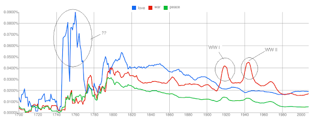
    The Google  Books Ngram Viewer shows the frequency of occurrences of the words over the duration specified (from 1700-2008)  in the various books scanned by Google. This is pretty cool, and one doesnt have to download all the book information and then do a frequency analysis. Also the viewer supports multiple words to be specified and see how they trend over the years.

    I quickly tried checking the trend for the words 'love', 'war' and 'peace' and following is the visualization of the same . You can view the chart and also play around with it(and other words ) with Google Labs Books ngram Viewer here.


    I am not sure what exactly happened during 1740 to 1770; to my limited knowledge 1760s saw Industrial Revolution. The spikes in the word 'war' during 1910s and 1940s correspond to the World Wars raging on then.  Did you notice that 'war' is again trending up and 'love' and 'peace' are going down?

    On a closer look, this looks to me like a direction reversal for 'war' and is it possible that we are going to see some bloodshed soon? Notice, that whenever there has been a direction reversal in the 'war' trend, there has been a war.

    Some more trend here , here , here and here .  Any other interesting words/phrases to be visualized? 

    Mozilla Open Data Visualization Entry-3

    This is my 3rd Entry to the Mozilla Open Data Visualization Competition.
    My 1st entry can be found here.
    My 2nd entry can be found here.

    In this entry , I have to tried to analyse how the age factor affects the usage of three of the features in Firefox 4, namely - Keyboard Shortcuts, Search and the new feature - Panorama. For this analysis, i used the small dataset from "Firefox 4 Beta Interface - Version 2". The following chart presents the data grouped as per the feature and shows the % usage of different age groups.


    Also, I have presented the top 3 often used keyboard shortcuts that are used by different age groups. In this, i have preferred a tabular layout, as i feel that data of this nature is best visualized using a tabular format(it is not necessary that every visualization needs to be presented
    in some bar or pie chart :)).


    The analysis does find that 18-25 and 26-35 age groups are the maximum adopters of the Panorama, Search and Keyboard shortcuts.

    Also, it is observed that 'new tab', back', and 'find' are widely used by the younger audience. The usage of the 'back' and 'new tab' keyboard shortcuts drops as the age of the audience increases.

    December 18, 2010

    Mozilla Open Data Visualization Entry-2

    This is my second entry to the Mozilla Open Data Visualization competition. You can find my earlier entry here.

    This Entry tries to analyse how people spend time on the Web. In this entry too, i have tried to analyse on four fronts. [But these are generic compared to my previous entry - i.e, my previous entry was more w.r.t users and their relationship with Firefox; whereas this Entry is mainly related to the user's general behavior - which were obtained from the Firefox Survey. Nevertheless, this analysis does give some insights into various facets of user-web interaction]

    1) Does the knowledge of Computer or the Web affect the way users visit various websites?


    2) How do people come to know about the latest computer technology and trends?


    3) What is the phone ownership pattern of the users who own a smartphone?


    4) On what kind of websites do people spend their time?


    [I have deliberately avoided explaining the interpretations and understandings - as I believe that the numbers speak for themselves. However, any doubts in the charts can be explained]

    My 1st Entry to this competition can be found here.
    My 3rd Entry to this competition can be found here.

    December 17, 2010

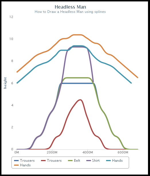
    How to draw a Headless Man using Splines

    Tools Used : HighCharts, some creativity, and loads of patience :)

    India ZIPScribble Maps

    And it so happens that i managed to get a handle on all the zip codes in India and their corresponding longitudes-latitudes. This is what you get when you connect all the zipcodes in India :


    And then when you order the long-lat pairs :


    The next in this series is going to be :
    1) Calculate the total distance travelled when you connect all the zipcodes (from map#1).
    2) Do a TSP(Travelling Salesman Problem) on the zipcodes (from #1 above) and plot the route. Calculate the distance.
    3) Do #2 for each of the states. (this "can" be used when you are planning your travel)

    December 16, 2010

    Mozilla Open Data Visualization Competition

    The following are the results of my analysis of the data from the Mozilla Open Data Visualization Fall 2010 contest. I downloaded witl_small.tar.gz (from "A Week in the Life of a Browser - Version 2" ) which contains a sample of the data for my analysis.

    I did not download the full set as my bandwidth has been crappy for sometime and also was running out of time. (The queries can be run on the FULL data though.) Mozilla has provided many attributes related to the various activities on FF (and there are SO MANY of them!). Since i stumbled on this contest pretty late in the game, i was unable to analyse ALL the attributes/dimensions. I preferred tackling a few questions in good detail than analysing many dimensions without much depth.

    So my analysis consists of the following 4 visualizations which try to answer 4 different questions.

    Tools Used : Protovis, HighCharts, Python, SQLite3 (Excel was used for Preliminary analysis/data cleansing)

    1) What is the Web usage pattern of people of different age groups?
      Or in other words, What is the average number of hours spent by someone who is 30 years old?


    2) Is their a correlation between the number of years being associated with Firefox and the number of hours spent on the Web daily?
    or in otherwords, do people who have used Firefox for 3-5 years or more, spend more number of hours using the Web Daily?


    3) What kind of bookmark activity do people do who are associated with Firefox for a number of years(we analyse *only* those who use any of the bookmark feature)
    i.e, how is the bookmarking creation/choosing/modifying spread among the bookmarking operations?

    (In the above chart, you will find 3-6m column being empty - the reason being, there was no data for this in the sample - i hope that the same is present in the full data set).

    4) How do different age groups function w.r.t various features on the Firefox?
    Note: this chart is to be read vertically - i.e, for a given feature, lets say Private Mode, which is the age group which uses this feature often? You will find that on viewing the column Privatemode, the age group 18-25 has the darkest color, which means that this is the age group which uses the feature often. Hence, the color gradient from the lightest to the darkest encodes the least to most often used.


    [I have deliberately avoided explaining the interpretations and understandings - as I believe that the numbers speak for themselves. However, any doubts in the charts can be explained]

    My 2nd entry to this competition can be found here.
    My 3rd entry to this competition can be found here.

    December 15, 2010

    ChronoDrop - Visualizing Events

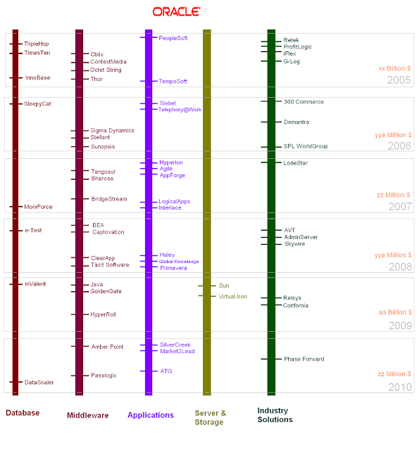
    I always liked Subway Maps - they are easy to understand and also look visually pleasing. And then i stumbled on the following visualization wherein Subway Maps are used to show the Acquisitions that Google had made over the past few years. The graph does look good, and shows the domain of the firm by color coding the 'route'.


    But this graph suffers from a BIG defect : it does not show the 'time' factor; as in, we do not know the sequence in which Google acquired the companies. Also, it does not show the amount shelled out by Google in acquiring each of the firms. And I wanted to rectify this by choosing a better medium.

    I am not a designer and my illustration skills are very limited. Hence i mostly restrain myself to charts and graphs than creating a kicka$$ poster or infographics illustration. But, the problem was very interesting and i thought i would take a dig at this and also see how good I am with some illustration skills.

    I devised ChronoDrop - a visualization technique to group and order events that have an associated time factor. Assumption being, the events do not belong to multiple groups(/domains) and are to be represented in a timeline. So, in this case, a company cannot belong to both Social and Technology - we demarcate the separation in strict terms so that the readability is enhanced.

    In the following illustration, I used ChronoDrop to show the acquisitions that Oracle has done since 2005. The companies are divided based on the domain - like, databases, middleware etc.


    Why did i call it ChronoDrop?
    - Well, 'chronos' personifies time and i wanted this representation to be based on events which are spread across time.
    - And why Drop? I always preferred scrolling down than scrolling horizontally. How many times do we scroll horizontally? In fact, good UI designers despise horizontal scrolling; i have seen numerous instances, wherein presence of a horizontal scrollbar is loathed upon (more than that, horizontal scrolling is just a BIG pain in the a$$).

    Some more modifications could be done to ChronoDrop, like,
    1) making the font of the Company name scale according to the amount spent on acquiring it. I wouldn't prefer logos, as images can cause a quadratic change (also they become quiet inefficient unless/otherwie the graphic is to be printed as a poster).
    2) If animation was possible, then we can show the Date of acquisition(and any other details) when the mouse is hovered over the company name (hyperlinks are always possible). I did not want to display the amount in the 'static' image, as I did not want to clutter the viz.
    3) The amount spent on the acquisition can be shown in the static image, but this requires some illustration skills which i do not readily possess. For eg. If we can increase the image size, then we can easily accomodate the cost factor beneath the organization name.

    Something that i liked about ChronoDrop is that, this graph can be generated programmically pretty easily. I hope to generate a library for this sometime.

    Well, i do not think ChronoDrop is a game changing technique/representation in the visualization field, but this my FIRST attempt at designing/conceptualizing a medium in this arena.

    Probably, some more useful illustrations of ChronoDrop :
    - IMDB's top 250 movies based on genre grouped by release dates.
    - Comparing the tenures of the US Presidents with that of Indian Prime Minsters; scams during the respective tenures could be interspersed.
    - Sporting events(cricket, football, hockey, archery, tennis, badminton) over decades
    - Various Natural Calamities(Earthquakes, Typhoons, Floods/Landslides, Volcanos) over decades.

    Around the World in 14 Hops

    "Boredom leads to inspiration". One uneventless bored noon is enough to do anything - and i went world hopping; and it takes only 14 hops - with one of them being tracing the same route(9,10).


    Just if you missed noticing, the above map appears on Facebook login page.

    December 14, 2010

    Scribble Map

    I was looking for possible visualizations using maps on the Internet; thinking as to how people would be using lat/long details to present information. One obvious example would be use maps to show the sales/revenue spread across the various LoBs of an organization. Many enterprises capture the spatial information and display along with the 'regular' data(sales/revenue..etc etc). By the way, spatial maps, however simple they might sound are very important to bring a breath of fresh air into an otherwise uninspiring presentation of Enterprise data - you no longer work with tables, but directly on the map-region wherein the action is taking place.

    But was there more that can be done with maps? Anything more funny and hackworthy? And then i stumbled on ZIPScribbleMaps - i found this extremely interesting; especially for a country like India which is huge and diverse, some visualization w.r.t Pin codes (or Zip codes) would be neat.

    I quickly searched the web for a complete list of India Pin Codes, but it was quiet funny that i was not able to find it anywhere. You have to pay to get this information - especially if you want the zipcodes along with the lat/long information. (I think Govt should opensource this).

    The following shows the ZIPScribble map for the state of Andhra Pradesh (I will do this for the rest of the Indian States soon - probably this weekend).I used the Google Maps API v2 and plotted the polylines between the pin codes, and this is what you have :

    The first map shows the scribble, when all the pincodes are arranged in ascending order and lines are drawn between two consecutive postal codes.


    The Second map shows the scribble, when we remove the duplicate lat-long pair and arrange them in ascending order (So that a PIN is not repeated).

    December 13, 2010

    Hollywood movies Visualization -Trilogy Meter

    Spent some time scraping the data from IMDB - ended up manually scraping the data for the 10 movie trilogies that I always liked. This was more of a personal project as in I wanted to see how trilogies fared - in terms of budget, revenues and the final ratings that the users provide. The rating shown is the rating of that particular part of the trilogy on 12-Dec-2011 from IMDB.
    Each of the bars in each of the graphs of Budget,Ratings and Gross Revenue denote a part of the respective trilogy, with the leftmost bar being part 1, mid being part 2 and the right bar being part 3.

    December 12, 2010

    December 10, 2010

    World's Billionaires Visualization

    I always wanted to be RICH (just like everyone else) :)
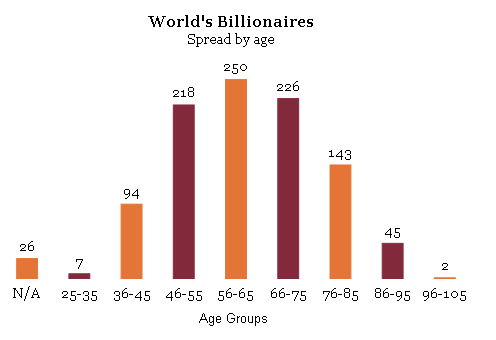
    There are 1101 Billionaires in the World in the year 2010 as released by Forbes Magazine. Now, I have the data and some interesting patterns can be deciphered. Some visualizations from the data set.

    Spread of Billionaires across Age Groups:


    Spread of Billionaires across Countries would be a usual visualization. So here is a quick heatmap of the same. I used openheatmap to create this - i would have ideally preferred that i am able to choose the colors so that the gradients are more pronounced and show the spread (but alas!). You can also interact with this map in here.


    The Forbes list also gives the details of the Citizenship and the Residence of the Billionaires. This data can be used to find out the pattern here; i.e, find out the billionaires whos Country of Citizenship is not the same as Country of Residence; or try to find out how the countries of Residence and Citizenship correlate; which is the thickest arc in the data which links two countries? (though i would have preferred that clicking on the arc leads shows some useful tooltip, but i was not able to find that option in Protovis).


    Also, some interesting facts came out of the data:
    • There are 8 'couples' - as in, set of 2 persons whose combined assets touch 1billion or more.
    • Of the 1101 names, there are 105Families; the total asset value of these 105 Families is 2990.4 Billion $. Top 3 countries having the rich families : US(25), China (9), India (7).
    • The combined wealth of all the Billionaires is close to 3567.8 Billion $.
    • Top 5 Countries measured in terms of the highest net worth of the Billionaires: USA(1349.3), Russia(265), India (222.1), Germany(217.7), China(133.2). (Again, this data can be showed as a heat/choropleth map, but i did not want to overdo on this viz). 
    • One more interesting observation would be to find out how age and the wealth work together. So, i quickly divided age by wealth to find out the most 'successful' - 'Success' here is defined as those whose age/wealth factor is as close to 1. And i found that top 5 on this race are :
    1.    William Gates III (Rank:2, Age:54, Worth:53, Success Factor:1.0)
    2.    Carlos Slim Helu & family (Rank:1, Age:70, Worth:53.5, Success Factor:1.3)
    3.    Warren Buffett (Rank:3, Age:79, Worth:47, Success Factor:1.7)
    4.    Mukesh Ambani (Rank:4, Age:52, Worth:29, Success Factor:1.8)
    5.    Eike Batista (Rank:8, Age:53, Worth:27, Success Factor:2.0)

    The following visualization was more of a fun factor. It shows the tag cloud of the names of all the Billionaires in the world. The font size shows how frequent some of those names occur.

    December 07, 2010

    Data Visualization Fail # 2


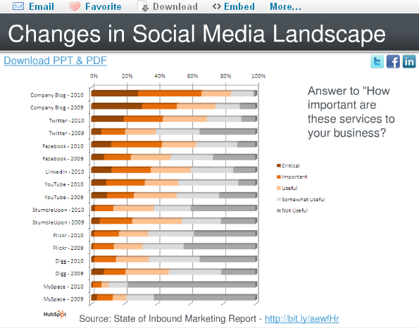
    In the following set of charts i have tried to highlight some 'pain' points and also suggest how these charts can be made more attractive without sacrificing the 'data quality'. All the charts were obtained from the presentation present here.   I stumbled on this presentation at Slide Share which has a few marketing charts, and i think i can use this to present some of the visualization gotchas or chartjunk.
    Again, the idea is not to criticize the author of these charts but valuable suggestions on how to make 'beautiful' presentations from the same set of data. Due to lack of time, i am not able to generate the equivalent 'beautiful' charts, but would definitely present the suggestions.

    Chart 1: 
    a)  Background grid lines can be removed
    b)  Since the value associated with the bar is already displayed at the top of the bar, i wouldnt necessarily be having a Y-axis.
    c) I would prefer a Tufte Graph for this - makes more sense as the number of bars are less.
    d) The color chosen is good and also the axis descriptions are neat.


    Chart 2:
    a) Though there are only two pie charts being used here, and each of them has only 3 regions, we might think that probably it fits the use-case here, but i feel a set of histograms or line graph would  make this even beautiful.
    b) I would always suggest a Tufte Graph when the number of regions is very less and there are not many dimensions to be considered.
    (There is nothing 'criminally' wrong in using pie chart here)


    Chart 3:
    a) Two pie charts  with many regions!!!
    b) Color chosen are not good.
    c) Colors do not show the intention - on the first glace it looks to me that Direct Mail, Trade Shows and Telemarketing are to be clubbed together and so be "Email Marketing" and "Other" & PPC and SEO - i think this is a strict NO-NO.
    d) Prefer a simple bar graph.
    e) Also there a BIG chart ERROR : In the 2009 graph, we see Blogs and Social media in ONE pie which comprises 9% whereas in 2010 graph, these two are divided  into two pies. ~dumph~


    Chart 4:
    a) The hort.stacked bar chart is an overkill here.
    b) Tough to read
    c) The % scale on the hort axis does not make sense to me. Would have preferred the number to be present in each of the 'pieces' of the bar.


    Chart 5:

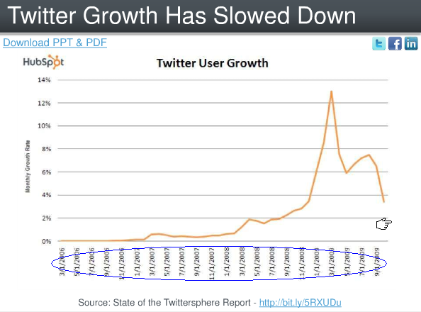
    a) Date Format - me being from the Indian Subcontinent, i always have a trouble when date format is given to me in xx/xx/yyyy format - i am not sure whether the first xx is a month or date. I always prefer the dd-mmm-yyyy or dd-mmm'yy format. In this kind of a graph, where growth rate is to be shown, mmm-yy would have been perfect.
    b) Rather than chosing the Growth Rate, i would preferred the number of active users on the Y-axis. This is a small nit.
    c) Clustering on a Q-on-Q basis would also have been better.


    December 05, 2010

    Data Visualization - Charts and Libraries

    When i was searching the net for possible Data Visualization libraries i stumbled on many. The following are some of the charting libraries that i have compiled from the Internet (i got the main ones from the following two links : here and here .) I have lifted the text associated with the libraries from these 2 links; however i will reviewing them personally too, as and when time permits.

    I will be updating when i stumble on any library that is interesting; libraries that can be quickly learnt and used. I will mainly be concentrating on Free libraries. Please do add a comment if you want to recommend anything interesting too.

    At this moment I want to thank all the authors/designers who are behind these libraries and have contributed significantly to the data visualization arena.

    Ajax.org 
    Ajax.org Platform is a pure javascript application framework for creating real-time collaborative applications that run in the browser.
    http://www.ajax.org/

    AnyChart
    AnyChart is a flexible Flash based solution that allows you to create interactive and great looking flash charts.
    http://www.anychart.com/products/anychart/gallery/

    Axiis
    Axiis is a Data Visualization Framework for Flex. It has been designed to be a concise, expressive, and modular framework that let developers and designers create compelling data visualization solutions.
    http://www.axiis.org/

    BirdEye
    BirdEye is a community project to advance the design and development of a comprehensive open source information visualization and visual analytics library for Adobe Flex. The actionscript-based library enables users to create multi-dimensional data visualization interfaces for the analysis and presentation of information.
    http://birdeye.googlecode.com/svn/branches/ng/examples/demo/BirdEyeExplorer.html

    Bluff
    Bluff is a lightweight charting library that ports Ruby’s Gruff gem to JavaScript. Weighing at only 11KB gzip’ed (you also need JS.Class which only weighs 2.6KB gzip’ed), it’s surprising that you’ll be able to get 15 different types of charts out of this library. It features tooltips, a ton of configurable options, legend support, and the .set_theme method for declaring reusable themes.
    http://bluff.jcoglan.com/

    Degrafa
    Degrafa is a declarative graphics framework for creating rich user interfaces, data visualization, mapping, graphics editing and more.
    http://www.degrafa.org/samples/data-visualization.html

    DojoX Data Chart
    An addition in the Dojo 1.3 release is the new dojox.charting class. Its primary purpose is to make connecting a chart to a Data Store a simple process.
    https://user.sitepen.com/~mwilcox/Chart/DataChart.html

    Chronoscope
    If you need to visualize thousands or millions of points of data, check this out. Very well designed and can be navigated with the keyboard or mouse. There's a Javascript API, a Google Visualization API or try it as a Google Gadget on Google Spreadsheets, iGoogle, or Open Social.
    http://timepedia.org/chronoscope/

    Dundas
    Dundas has a wide range of data visualization solutions for Microsoft technologies. They offer a number of data visualization tools including: Chart, Gauge, Map and Calendar for .net and Dashboards for Silverlight.
    http://www.dundas.com/Components/Gallery/ASP/

    Dygraph
    dygraphs is a JavaScript library for producing interactive charts for time series data. It was designed to plot dense data sets (such as temperature fluctuations). It has user interfacing options such giving the user the ability to specify time intervals on the fly, displaying of values when mousing over parts of the chart, and zooming. It also integrates with the Google Visualization API.
    http://www.danvk.org/dygraphs/

    ExtJs
    Ext JS is a cross-browser JavaScript library for building rich internet applications. It now includes charts.
    http://www.extjs.com/products/extjs/

    FusionCharts
    Animated flash charts for web apps. Looks like they work with most technologies.
    http://www.fusioncharts.com/Gallery/Default.asp

    Google Chart API
    The Google Chart API lets you dynamically generate charts.
    http://code.google.com/apis/chart/types.html

    gRaphaël
    gRaphaël is a Javascript library to help you create stunning charts on your website.
    http://g.raphaeljs.com/

    Highcharts
    Highcharts is one of the most promising JavaScript charting libraries to hit the scene recently, with its large array of features including seven charting types (line, pie, and bar among them),  the ability to zoom in and out of charts, and tooltips for offering more information about data points.
    http://highcharts.com/

    iLog Exlixir
    Enhance data visualization within Flex and AIR applications with IBM ILOG Elixir.
    http://www.ilog.com/products/ilogelixir/demos/

    Javascript InfoVis
    JavaScript InfoVis, a charting library influenced partly by MooTools, is a robust and excellent solution for data visualization. It’s modular (just like MooTools) so that you can include just the parts you need to keep your pages light. It has animation effects capability to captivate and engage your users, plenty of charting types, a helper class for working with JSON data, and much more.
    http://thejit.org/

    JFreeChart
    Creates charts such as bar charts, line charts, pie charts, time series charts, candlestick charts, high/low/open/close charts, wind plots, and meter charts.
    http://www.jfree.org/jfreechart/samples.html

    JQuery Plugins
    There ar a lot of JQuery chart pugins:

        * Visualize by the Filament Group
          http://www.filamentgroup.com/lab/jquery_visualize_plugin_accessible_charts_graphs_from_tables_html5_canvas/
        * JQChart
          http://plugins.jquery.com/project/jQchart
        * Flot 
          http://code.google.com/p/flot/
        * Sparklines 
          http://omnipotent.net/jquery.sparkline/
        * TufteGraph 
          http://xaviershay.github.com/tufte-graph/
        * jQuery Google Charts(jGCharts)
          http://www.maxb.net/scripts/jgcharts/include/demo/
        * jqPlot
          http://www.jqplot.com/

    JPowered
    The PHP graphing scripts provide a very easy way to embed dynamically generated graphs and charts into PHP applications and HTML web pages.
    http://www.jpowered.com/

    JSCharts
    JS Charts is a JavaScript chart generator that requires little or no coding. JS Charts allows you to easily create charts in different templates like bar charts, pie charts or simple line graphs.
    http://www.jscharts.com/

    JSXGraph
    Developed at the University of Bayreuth in Germany, is a standalone JavaScript library for plotting complex geometric shapes and data such as Bezier curves, differential equations, and much more. It has animation features for moving graphs, interactive components such as sliders for experimenting with changing values of variables, and plenty of charting types to choose from.
    http://jsxgraph.uni-bayreuth.de/wp/

    Kap IT Labs Diagrammer and Visualizer
    Kap Lab's Diagrammer provides ready-to-use yet highly customizable multi-layout data visualization and diagramming for Adobe Flex and Air.
    http://lab.kapit.fr/display/kaplabhome/Home

    MilkChart
    A simple to use, yet robust library for transforming table data into a chart. This library uses the HTML5 tag and is only supported on browsers other than IE until ExCanvas gets proper text support.
    http://code.google.com/p/milkchart

    MooChart
    For now, moochart only plots bubble diagrams, but there are plans to expand this MooTools 1.2 plugin to feature pie, line, and bar graphs. The plugin has 14 options that you can use for customizing your diagram’s look, and tooltips for providing more information about a bubble when mousing over them. moochart is open source and released under the MIT license.
    http://moochart.coneri.se/

    Open Flash Charts
    Open source Flash charts.
    http://teethgrinder.co.uk/open-flash-chart-2/

    PlotKit
    PlotKit is a Chart and Graph Plotting Library for Javascript. It has support for HTML Canvas and also SVG via Adobe SVG Viewer and native browser support.
    http://www.liquidx.net/plotkit/

    ProtoChart
    Protochart is a JavaScript library for use with the Prototype JS framework. It uses HTML5’s canvas for modern browsers, and the ExCanvas library for Internet Explorer support. It has six types of charts including line, pie, bars, points, lines with points, and area graphs. It allows for the display of legends that are highly configurable to help identify items on your charts.
    http://www.deensoft.com/lab/protochart/index.php

    Protovis
    Protovis composes custom views of data with simple marks such as bars and dots. Unlike low-level graphics libraries that quickly become tedious for visualization, Protovis defines marks through dynamic properties that encode data, allowing inheritance, scales and layouts to simplify construction.
    http://vis.stanford.edu/protovis/

    Style Chart
    Style Chart is a free JavaScript-based charting web service/API for creating hosted charts. It’s also available as a downloadable library in case you want to host your own charts (though you need to register in order to download it). It has the things you’d expect from a robust and configurable charting library such as tooltips, legends, and 19 types of charts including 3D pie, 3D bar graphs and Pareto charts.
    http://chart.inetsoft.com/

    Telerik Charts for Silverlight, WFP, ASP.NET
    Telerik Charts offers rich functionality and data presentation capabilities.
    http://www.telerik.com/

    Timline
    Timeline is a JavaScript widget for creating interactive timelines. You can scroll through items featured in chronological order by using your mousewheel or by holding down your mouse button on the timeline and dragging left or right. Clicking on a dot, which represents an item in the time line, will reveal more information. Timeline is open source, released under the BSD license
    http://www.simile-widgets.org/timeline/

    TimePlot
    Timeplot allows you to dynamically generate time series graphs. Hovering over data points reveals their value. Timeplot was developed as part of the SIMILE Project at MIT. Here’s a step-by-step tutorial on how to utilize Timeplot. Timeplot is open source and available the BSD license. The Timeplot demo and download links are on this page
    http://www.simile-widgets.org/timeplot/

    December 01, 2010

    Data Visualization Fail # 1

    The following chart is from Transparency which shows the Corruption Perceptions Index for 2010.


    The highlighted blue circles are the regions wherein the color difference is most minimal. I dont think using very minor color gradients in visualization is going to help much in understanding the spread. A first look at the map, demarcates the world in to American(with Oz and North EU) and non-American countries as only Yellow and red are the prominent colors. Regions that are highlighted , using blue circle, do have a variation in the perception index, but to the proximity of the gradient our eye fails to catch them. The best example is probably, South Korea(5.4) and Japan(7.8) - there is indeed a problem here. These two countries  fall in two different slabs , and there is a 30% difference in value between them, but on a cursory glance we fail to notice this difference. Similarly, countries within African, European and Asian continents cluster together,
    if there is a small country which stands out from the group, then this viz fails to show that.

    Remember that color is never seen alone, color is always seen based on what is surrounding it. An effective use of  color will group related items and command attention inproportion to importance. Colors are the most neglected  and also the most abused factor in any chart. Colors also show the intention of vizualization.

    This is a typical case of "Chartjunk due to colors"  . One might opine that one can always zoom in and see the difference, but let me show you what happens when i zoom in on Eastern EU.


    But, the viz also scores some marks on some other positive aspects:
    - An excellant legend (though i would have preferred the words "Very Clean" and "Highly Corrupt" to be placed more closer to the values)
    - Displays the countryname/index value on hovering over the country.
    - Prescence of a table below the chart which ranks the countries - and this table can be sorted/searched. (the rank information here would have been an icing)
    - A multiplication factor of 10 on the Index would have been easy to read ( its easy to read 10-20, 20-30, than 1-2,2-3)