Showing posts with label visualization. Show all posts

June 01, 2014

Top-5 Videos Watched in May-2014

(In no specific ranking order)

1. Admiral Bill McRaven's Commencement Speech at University of Texas at Austin 

U.S. Navy Admiral and University of Texas at Austin alumnus Bill McRaven returned to his alma mater last week to give seniors 10 lessons from basic SEAL training when he spoke at the school's commencement. McRaven - the commander of the U.S. Special Operations Command and organized the raid that killed Osama Bin Laden.

Do not mistake this as just another 'commencement talk'; if India respected our soldiers and had the notion of 'commencement speeches' in our colleges, then am sure we would be hearing some of the best experiences from our borders, but till then, lets resort to the most developed nation doing the honors.


2. Scott Adams (creator of Dilbert) at IBM Connect 2014 
On the topic of success, based on his new book: How to Fail at Almost Everything and Still Win Big.

Cartoonists are the new self-help gurus/motivational speakers with no sugar-coating and full of sense.


3. Simon Sinek: Why Leaders Eat Last

Why are leaders so so awsum? And why you should know the difference between 'leadership' and 'leader' and 'authority'.


4. 'What-If' by Randall Munroe (of xkcd)

Web cartoonist Randall Munroe answers simple what-if questions ("what if you hit a baseball moving at the speed of light?") using math, physics, logic and deadpan humor. In this charming talk, a reader's question about Google's data warehouse leads Munroe down a circuitous path to a hilariously over-detailed answer.

Something that many of us lack : Curiosity, Power of imagination and rational thought-processes.


5. Mike Monteiro - How Designers Destroyed the World

Profanity that makes so much sense! A must-watch for all 'makers', 'creators', 'innovators', 'designers' etc.


Bonus video:
Alberto Cairo(author of 'The Functional Art') , at Tapestry-2014, hits hard at the present day world of journalism and data-visualization.


May 31, 2014

Visualizing - Executed Offenders in Texas

I happened to stumble on this thread in HN, which was trending. The thread is on executed offenders in Texas since 1982. It has totally 515 persons in its list and the sheer number of people in the last few decades was what surprised me, and that too in a single US state. My personal interest in tracking crime in India(viz coming soon) led me to do a quick analysis of this data and some of the numbers were interesting(not to mention 515 in itself!).

Note that this is purely an experimental visualization and my intentions are not to play with the numbers of the dead. Also, I would highly recommend the readers of this post to read the comments in the original thread at HN to get some very interesting view points.

Now off to some charts...I hope all of them are self-explanatory and do not need any commentary.

Number of people executed in the Age Group

People Executed by Year

Top-10 Counties with maximum executions

Tag Cloud of the Last Names of the executed people

Executions by Race (Note : I do not know why the data contained this facet!)

May 21, 2014

Visualizing Funding of Companies in India

It all started with me trying to understand the funding scene in India and how companies are getting funded - at which stages, how much, from where and who are the primary investors. With this, the hunt for data started and culminated in the Crunchbase Exports(as on 1-Apr-2014). The data was structured well, but OpenRefine was used to cleanup the data - cities with typo in their names and different cases were clustered into simple buckets. Other than this, no other manipulations were done. The data, for India, mainly starts off from Jan-2005(and ends at Mar-2014) and there are a total of 1150 records contains various details of the investments made. I do not think this is an exhaustive list, but it was a good start to looking into it and getting answers to some of my questions.

Lot of cool visualizations can be done to capture the various insights from the data, but I think histograms do a pretty good job and are readable to a vast majority. Lets proceed...

The first was to understand the spread of companies across cities, and without even thinking twice, Bangalore simply wins with the maximum number of companies. A slightly distant second is Delhi(this includes Noida, Gurgaon etc - if the details matter to the reader).


It is imperative to know the funding obtained across cities, and here too Bangalore wins with 4.6B$ and Delhi comes a close second at 4.4B$.


Fortunately, Crunchbase contains the details of the funding type and the other associated details. The spread of funding - as in, the type of funding and the count of it was an interesting thing to see and followed the expected patterns of Angel being in the top-slots.


But, it is important to know how much money do these different funding types bring to the table, and the patterns just got reversed with Angels going off from the top slots. I think, it would be extremely useful if Angel occupies the top-slots - this would signify that the startup ecosystem has no dearth for money and many startups are getting benefited due to angels; it is to be understood that the quantum of money involved in one particular round of Series-b(and above) is substantially more and is not to be compared with that of Angels.


The following chart would be useful as it superimposes the number of companies with a particular funding and the sum of the money raised in that type.


Probably, the following chart would best show the point above. It average money involved in a particular fundting type and shows the average and the maximum in such a category. Seriec-C+ has an average of 45M$ and the max is 200M$ (Tokyo's SoftBank investing in InMobi); whereas Private-Equity has an average of 49M$with a maximum of 300M$ (USA's Quadrangle Group in Tower Vision).


The top investors are listed in the below viz with Tiger Global Management(TGM) being in the first slot with 718M.


But the above number starts making more sense when the reader knows that TGM has invested only in 10 rounds whereas IDG ventures has invested in 48 rounds.


Half of the investments(7.5B$ out of the 14B$ invested since 2005) are primarily coming from USA, with India itself coming a close second and many other developed nations occupying the tail.


With the above, it is an added bonus if we known when the investments came in and does this have any bearing. Though I have not yet done any correlation of when the investments came in(i.e which quarter) and the eventual success of the company, it is interesting to observe the pattern in the following chart. Q1 clearly is the winner with the maximum funding and also the max companies getting it.


And finally, if that was a histogram(bar-chart) overdose, lets use a Sankey Diagram to visualize the money coming from different countries and flowing into companies situated in different cities in India. This graph is actually interactive and width of the arcs shows the amount of money involved in the funding round and clicking on it takes to details - but for the sake of this blog post, a screenshot of it should probably end this analysis.


Click on the Image to view it in  full size.


May 15, 2014

Elections - Lok Sabha 2014 Analysis : Trivia


Word Cloud of Candidate's Family/Last Names

Word Cloud of Candidate's First Names

Word Cloud of the Political Party Names


Youngest Candidate : 
Ravikant Yadav  . IND. 21 years. JAUNPUR, UTTAR PRADESH .
Oldest Candidate     : 
Ram Sundar Das . JDU. 93 years. HAJIPUR, BIHAR

Youngest Crorepati : 
Farooq Khan . BSP . 25 years. JAIPUR, RAJASTHAN.
Oldest Crorepati     : 
Lal Krishna Advani. BJP. 86 Years. GANDHINAGAR, GUJARAT

Constituencies with Max Candidates  : 
42 each in VARANASI &   CHENNAI SOUTH
Constituencies with Least Candidates : 
2 in TURA (MEGHALAYA)
Candidate with the Longest Name:
Venkata Swetha Chalapathi Kumara Krishna Rangarao Ravu [ 54 Years old. YSRCP. Vizianagaram, Andhra Pradesh ]

Also,you might like:

Elections - Lok Sabha 2014 Analysis : Criminal Cases


Total Number of Candidates : 8234


Number of Candidates with Criminal Cases : 1398
Assets Held by Candidates with Criminal Cases 

Rs. 10,734 crores


Number of Convicted Candidates : 29

Assets Held by Convicted Candidates : 

Rs. 112 crores


Top-10 Candidates with cases against them (party and education mentioned along)

Cases vs Party
Clean and Accused Candidates in Parties

Percentage of Candidates who have cases Pending against them across Parties

Convicted Cases across Parties

Top-10 States with maximum number of Cases
Top Constituencies with Max Cases (Kanyakumari and Thuthukudi, which are the top-2(with 350+ cases) - candidates belonging to AAP, have been removed for easier readability)

Cases vs Education of Candidates

Gender and Age vs Cases

May 14, 2014

Elections - Lok Sabha 2014 Analysis: Money Power


Number of Candidates: 8,234

Total Assets Declared

Rs. 40,300 crores or Rs. 403 Billion

Total Liability

Rs. 3,255 crores or Rs. 33 Billion

Number of Candidates by Age-Group

Assets Declared by Age Group

Top-10 Richest Candidates
Spread of Assets by Education
Assets Declared by Gender and Age-Group


Assets Declared by Gender


Assets by Party

Top-10 States by Assets Declared


April 12, 2014

Quick Analysis of 2014 Indian Election Manifestos


BJP Manifesto
- 
- 'Development'(77), Government(65) and Technology(54) are the Top-3 words 
- 'Muslim', 'Hindu' appear exactly once; and there is no direct reference to 'Hindutva'
- Loads of emphasis on technology(for eg. broadband, internet, computer etc) to implement suitable measures.
- 42 Pages,16892 Words
- my Note : Thanks to the publishers as it was easy to get the txt from the PDF.

AAP Manifesto
- Government(39), Education(37) and Security(34) are the Top-3 words 
- ''Muslim' appears 14 times; Hindu' appears exactly once.
- No clear emphasis on any theme.
- 24 Pages, 9806 Words
- my Note : Please publish your content in such a way that it can be consumed. Cannot extract txt from the pdf.
Word Cloud of BJP 2014 Manifesto

Word Cloud of AAP 2014 Manifesto


Word Count of some of the top issues in the respective party manifestos


January 19, 2011

Do you have any of these buzzwords in your resume?

Linkedin came out with the list of the top 10 most often used buzzwords  - the words that people use in their profiles while using linkedin from USA.

Top 10 overused buzzwords in LinkedIn Profiles in the USA – 2010
   1. Extensive experience
   2. Innovative
   3. Motivated
   4. Results-oriented
   5. Dynamic
   6. Proven track record
   7. Team player
   8. Fast-paced
   9. Problem solver
  10. Entrepreneurial

Also, they did some analytics on these buzzwords and found out that the phrase "Extensive experience" is most often used in  profiles of people from Australia, Canada and USA whereas people from Brazil and India mostly use the term "Dynamic". 'Innovative' is most often used in the European region; goes onto show why the Dutch always master the art of design.


This analysis by the Linkedin team has led to many revamping their profiles to avoid the so called 'cliched' terms. Do you have any of these buzzwords in your resume? Do you like it? Will you change it after this study or will include it in your profile if you already do not have it?

January 13, 2011

Analysis of My First Mozilla Open Data Visualization Competition Entries

The First Mozilla Open Data Visualization Competition results are out. I had submitted 3 entries [one] [two] [three] for this competition and as I had imagined, my entry did not win any nor did it get any mention (I would have been surprised if it had got any!).

I kind of expected this, and realized it during the last few weeks before the winners were to be announced. I reviewed my submissions and found that I had not done justice to my analysis and there were many open questions; or avenues that could be bettered.

Self-Analysis and Comments:
1. As soon as i saw the data I jumped on it. I loaded the sample data into sqlite3 tables and started firing queries and started generating the charts. THIS was a BIG mistake, I should have taken some more time to read the structure of the data and probably cleanse it, and normalize the dataset.
I think i was overjoyed by seeing a 'real' dataset and how i could 'directly' contribute to Firefox in this analysis. The adrenaline rush made me do this blunder.
2. I also spent quiet sometime googling the already submitted entries so that mine was different from others. Though, this helps sometimes, i think it pressurizes one more and narrows down the vision. Treating the data holistically and deriving all possible analysis, or choosing a subset of the data and then analysing it should have been the way to go.
3. I would like to again state the fact that i did not normalize the data - this was the crucial step.
4. I should have spent a weekend on developing a dashboard or webpage with which people could play around. The excuse of time prevented me from doing this.
5. Verbiage - charts/images are good, but it is always nice to include some verbiage along with it when you do not provide a dashboard kind of an interface.
6. Lack of any statistical analysis - most of the analysis that I have done are pure SQL query based manipulations. I am working on this front and learning more statistical analysis techniques, which will help me in the longer run.
7. Some of mycharts were pure junk and did not convey the right message!
8. I should have used better charting libraries - those that have better presentation and are pleasant to the eyes. In the adrenaline rush, i overlooked this aspect.I thought of moving the charts to protovis, but i was too lazy once i submitted my entries(and also i got pulled into other visualizations).

Having understood (and realized) the mistakes that i did, and also the loads of learning that happened during and after the contest has helped me a lot; and am better prepared for the next visualization/data-analysis challenge. This self analysis did help me a lot.

Btw... Mozilla guys are giving away free Tshirts for all participants :)

December 21, 2010

Data Visualization Fail # 3

I found the following chart in one of the reports by a Business Intelligence website which compared the various BI vendors based on different parameters. It chose a Vendor and then compared the Vendor with the Category Average and also the Maximum Category Score. This is a Radar Chart.


Now, lets improvise this chart.

For the sake of keeping things simple(read 'without programming'), i used Excel to show how some amount of effort and care to present 'useful' information would be beneficial for the readers. I quickly wrote down the various readings from the above chart into an Excel Worksheet:
Column1:The Metric Names(like Maturity, Scalability etc);
Column 2: Max Category Score,
Column 3: the vendor,
Column 4: Average Across Vendor),

selected the table data and Insert ... Choose the Column(Bar Chart) and voila ...you get Figure 1.

I find Fig.1 to be much much better and readable than the original Radar Chart. We can easily read how the vendor, the average and the max category score relate to one another. The default colors from Excel are also not bad; though i would have avoided the grid lines and have preferred the number mentioned on top of each of the bars.

But I still could not see the trend - trend in terms of how the Vendor fared w.r.t the others. Then i moved to choose a Line chart and you get Fig2. The line chart with the markers clearly show the trend and how close the Vendor is to the Category Average; and on some parameters, it max'es the Category Score and is purely the market leader.


I hope this simple example clearly demonstrated how good visualization techniques can help in better understanding and interpretation.

December 19, 2010

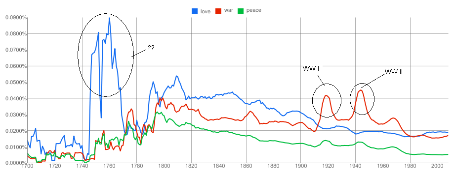
Visualizing War, Peace and Love over 3 centuries

The Google  Books Ngram Viewer shows the frequency of occurrences of the words over the duration specified (from 1700-2008)  in the various books scanned by Google. This is pretty cool, and one doesnt have to download all the book information and then do a frequency analysis. Also the viewer supports multiple words to be specified and see how they trend over the years.

I quickly tried checking the trend for the words 'love', 'war' and 'peace' and following is the visualization of the same . You can view the chart and also play around with it(and other words ) with Google Labs Books ngram Viewer here.


I am not sure what exactly happened during 1740 to 1770; to my limited knowledge 1760s saw Industrial Revolution. The spikes in the word 'war' during 1910s and 1940s correspond to the World Wars raging on then.  Did you notice that 'war' is again trending up and 'love' and 'peace' are going down?

On a closer look, this looks to me like a direction reversal for 'war' and is it possible that we are going to see some bloodshed soon? Notice, that whenever there has been a direction reversal in the 'war' trend, there has been a war.

Some more trend here , here , here and here .  Any other interesting words/phrases to be visualized? 

Mozilla Open Data Visualization Entry-3

This is my 3rd Entry to the Mozilla Open Data Visualization Competition.
My 1st entry can be found here.
My 2nd entry can be found here.

In this entry , I have to tried to analyse how the age factor affects the usage of three of the features in Firefox 4, namely - Keyboard Shortcuts, Search and the new feature - Panorama. For this analysis, i used the small dataset from "Firefox 4 Beta Interface - Version 2". The following chart presents the data grouped as per the feature and shows the % usage of different age groups.


Also, I have presented the top 3 often used keyboard shortcuts that are used by different age groups. In this, i have preferred a tabular layout, as i feel that data of this nature is best visualized using a tabular format(it is not necessary that every visualization needs to be presented
in some bar or pie chart :)).


The analysis does find that 18-25 and 26-35 age groups are the maximum adopters of the Panorama, Search and Keyboard shortcuts.

Also, it is observed that 'new tab', back', and 'find' are widely used by the younger audience. The usage of the 'back' and 'new tab' keyboard shortcuts drops as the age of the audience increases.

December 18, 2010

Mozilla Open Data Visualization Entry-2

This is my second entry to the Mozilla Open Data Visualization competition. You can find my earlier entry here.

This Entry tries to analyse how people spend time on the Web. In this entry too, i have tried to analyse on four fronts. [But these are generic compared to my previous entry - i.e, my previous entry was more w.r.t users and their relationship with Firefox; whereas this Entry is mainly related to the user's general behavior - which were obtained from the Firefox Survey. Nevertheless, this analysis does give some insights into various facets of user-web interaction]

1) Does the knowledge of Computer or the Web affect the way users visit various websites?


2) How do people come to know about the latest computer technology and trends?


3) What is the phone ownership pattern of the users who own a smartphone?


4) On what kind of websites do people spend their time?


[I have deliberately avoided explaining the interpretations and understandings - as I believe that the numbers speak for themselves. However, any doubts in the charts can be explained]

My 1st Entry to this competition can be found here.
My 3rd Entry to this competition can be found here.