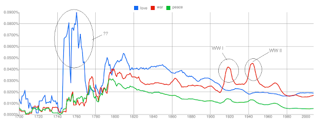
The Google Books Ngram Viewer shows the frequency of occurrences of the words over the duration specified (from 1700-2008) in the various books scanned by Google. This is pretty cool, and one doesnt have to download all the book information and then do a frequency analysis. Also the viewer supports multiple words to be specified and see how they trend over the years.
I quickly tried checking the trend for the words 'love', 'war' and 'peace' and following is the visualization of the same . You can view the chart and also play around with it(and other words ) with Google Labs Books ngram Viewer here.
I am not sure what exactly happened during 1740 to 1770; to my limited knowledge 1760s saw Industrial Revolution. The spikes in the word 'war' during 1910s and 1940s correspond to the World Wars raging on then. Did you notice that 'war' is again trending up and 'love' and 'peace' are going down?
On a closer look, this looks to me like a direction reversal for 'war' and is it possible that we are going to see some bloodshed soon? Notice, that whenever there has been a direction reversal in the 'war' trend, there has been a war.
Some more trend here , here , here and here . Any other interesting words/phrases to be visualized?

1 comment:
Very nice. But surprised to see all the love between 1760-1830s. This was when the American colonies were in ferment and the guillotine blade in france was never dry. Napoleon would also be rampaging through Western and Central Europe. Interesting.
Post a Comment