February 22, 2011

Along the Karnataka Coast Line

So, me and wifey decided to go along the West Coast of India to celebrate our First Anniversary. We just booked the ticket from Bangalore to Mangalore and let everythings take shape as it comes. Initially, I had some apprehensions of going till Gokarna as I feared that we might run out of time by the time we finish the Jain circuit and Udupi. But it so happened that we finished the Jain circuit in a day and had loads of time. And we ended up doing Moodbidri - Karakala - Venur - Udupi (Malpe, Kapu) - Gokarna (Kudle, Om). We could have always done Murudeshwar and Honnavar, but i wanted to relax for sometime and not have a strenous schedule, as work was burning me out.

Read on for a more detailed itinerary and some travel notes.

Day 1 - Friday
We had booked a sleeper bus from Bangalore to Moodbidri, and it so happened that the road was horrendously bad. We were on the upper berth, and it was jumping and wobbling for most of the time, hardly had a good sleep! (I think the stretch from Hassan and all the way upto Mangalore was crap!)

The bus started from Bangalore(Bannerghatta road around 7:30am and we reached Mangalore in the morning around 6:30am. We had not planned whether we want to do Mangalore or carry on to Moodbidri. In the morning, i felt that we should be doing the Jain circuit and then head on towards Udupi, than sticking to Mangalore. Mangalore can always be done when we plan to do Kerala ; something like, start from Mangalore and then onto Bekal-kasargod and the rest of Kerala). Anyway, the bus conductor asked us to get down at Jyothy bus stand if we are to catch a bus to Moodbidri. We had to walk across the road and wait for a bus which came in another 5mins. Reached Moodbidri in around 50mins. We had our breakfast in a hotel in the Moodbidri bus stand. We did not note the hotel's name, but it was pretty clean - though not duly whitewashed. A idli-vada and quick tea is always refreshing in the morning. Asked quickly for directions to the Thousand Pillar Jain Temple and then proceeded onwards. Enroute we stumbled on a Hanuman temple. I had opined that this was just another temple, but it looks like this Hanuman/Anjaneya temples is a very famous one in Moodbidri.

A quick walk lasting 15-20mins lead us to the Thousand Pillar temple. Photography is not allowed inside the temple premises. When we entered, there was hardly anyone inside. The intial few pillars on the leading face of the temple were looking nice - though not impresseive; the prangan(area surrounding the sanctum) and near the walls were unkempt with grass and wild plants. Unimpressive, i had expected much grandeur in this temple; though the brass statue of Mahaveera inside the temple glowing in the bulb within the sanctum was nice to look at. The pedestals were nice but the pillars were lacking the much needed intricate carvings.


A jaunt back to the bus stand and then a tea in the same hotel and then a bus to Karakala ensued. The journey was for around 30mins. The sun was pretty bright by now and we had to wear our shades, as we had to climb hundred odd steps to visit the statue of Gomatestwara on the top of the hillock. A few chocolates before the climb and a quick ascent lead us to a flat land with the monolith statue of Gomateswara standing in the middle, surrounded by two sets of walls - one very close to the statue itself and the one around the temple. Clicked a few snaps and sat here for sometime. The shade outside the temple was cooler than that of inside.


We then came back to the Moodbidri bus stand and caught a bus to Venur. Unlike the hillock in Karkala, Venur is pretty much at the ground level; few steps leads us to the monolithic structure which is again on a flat concrete ground.


Venur does not have many lunch options, so we had it in one Jain hotel which was clean, though the food was nothing great. The hotel owner told us that there are regular buses to Udupi from Venur, but little did we know that those buses go via Moodbidri(duh!).

(And thus i had seen all the big-4 monoliths of Gomateshwara in Karnataka - Shravanabelagola, Karkala, Dhramasthala, Venur ! Yay!)

We reached Udupi around 5:30pm in the evening. Took a hotel near the road that leads to the Krishna temple. The room was neat and clean, but not luxurious - you dont get a deluxe room for 300 Rupees!). Went on a walk near our hotel and asked for the best hotel in that area with a few passerbys; almost everyone seemed to suggest Woodlands and after a sumptuous meal there and a follow up walk near the temple, we retired for the day.

Note : Prefer doing Moodbidri, Venur and then Karkala in order. There are buses from Karkala to Udupi and you dont have to come back to Moodbidri, we didnt know about this and lost about an hour in the transit.

Day 2 - Saturday
We visited the famous Krishna temple in the morning around 8am. Lord krishna - a black idol - was kept in a small room which had many oil lamps lit and was not to be reached by anyone. Devotees had to have a view of the Lord via a small window - the sighting would last only for a few seconds. The rush was not much and we had a good darshan.


A breakfast at Woodlands ensued and we took a nap in our room. We again went to the Krishna temple in the noon - for the mid day prasadams - the meals. Surprisingly, the temple treats brahmins and non-brahmins differently. I was wearing a Jean and a T and we both stood in the line for the non-brahmins. We were told that only those who wore dhoti were eligible to sit in the area marked for brahmins (we wondered how easy this system could be tricked!). The meals for the non-brahmins are served in the first floor. Everyone is asked to sit down and the marble in front of them is to be washed and food is served on this. I would expect that the scene on the ground floor was to be completely different, with banana leaves and a much better quality of food. In the abode of God, such differentiation is to be frowned upon. On a philosophical note, i do not understand why Man always comes up with means and measures to differentiate people(his fellow beings) !


Anyway, we proceeded onto the Government Bus stand which runs buses to Malpe. Malpe is around 5-6 kms from the Udupi bus stand and from the Malpe bus stand you can catch an auto to reach the beach. I did not find anything spectacular about the beach, though there was a ship building/repair yard on the left hand side of the beach. It was around 2 in the noon, and we did not loiter in the sand, but sat on the bench and whiled our time. A boat ride to St.Mary's island could always be done, but this would be too much 'touristy'. We got a lift from the beach to Malpe Bus stand and then caught a bus back to the Government bus stand. We were told that buses to Kapu had to be caught from the Private(or Service) bus stand. Kapu is slighlty far off and the ride lasts for close to 30mins. One can walk from the Kapu bus stand to the beach or hire an auto; auto costs around 25-30. We preferred to walk.

Tip: When you get down from the bus at Kapu bus stand, get onto the other side of the road and ask for directions to the beach; they will lead you to a narrow lane - get onto that and then go straight, you will reach the bypass road, and then cross it and take the road next to the temple on the other side of the road, keep going straight; once you reach a T junction, take the left and then take diversion from the road onto the sand which is next to a few huts there, a few meters away is the beach. This side of the beach is virgin and not people/tourists visit here. Also, you can spend some time in the shade of the monolith rock there and then climb onto it too ;)
The more famous(read 'crowded') part of the beach is on the other side of this rock.


Kapu beach has a functional lighthouse(there is no port here) and the sunset from here is beautiful!

There was a local mela going on in the beach when we went there and then took an auto to the Kapu bus stand back (this one is on the Bypass road). Back to Udupi and retired for the day after a meal at Woodlands ;)

Day 3 - Sunday
We got up at around 6:45am and vacated the room by around 7:15am. The hotel's manager told us that Train was way better than bus, as the former would take 2-2.5hours to reach Gokarna than the latter which takes around 5 hours. Also the roads are not good. The train was to leave at 7:50am from the station. I wanted to try our luck and caught an auto to train station and reach there by 7:30. The rush in the station was just beginning and the queue for the tickets wasn't long. We got the tickets and had a quick breakfast in the station. The train arrived, not very crowded, one of us managed to get a seat while i kept standing for a while and exchanging seats. Reached Gokarna road by around 10:40am. There was mini cab/bus waiting outside and for 15 Rupee ride lasting for 15mins we reached Gokarna. We were not sure about the hotels to choose from - i.e, choose a hotel in Gokarna or prefer any of the huts along the beaches. Preferred to rest for sometime, have some lunch and then decide.

And so we stumbled on Hotel Sri Sai Ram, this is a small hotel next to the SBI ATM on the main road, before you enter Car Street. Little did we know that this hotel will be our place for lunch/dinner for our remaining stay in Gokarna. This clean hotel is run by a family - husband,wifey, a son and a daughter; and i think there are two helpers who get them along with the kitchen and other associated activities.

Post lunch, we roamed in the streets behind the gokarna bus stand looking out for rooms and here we stumbled on Katyayani Guest House. This is run by a gentleman who runs a provision store just outside his house. Our room was on the first floor - damp and a little unclean. But since we were budget travellers, we took this and quickly cleaned the room. A quick nap and a long walk along the Gokarna beach in the evening followed.

Day 4 - Monday
Getup at around 7:15am, breakfast at take the road next to Ganapati temple and then proceed towards Kudle beach and then onto Om beach. The trek to Kudle takes around 40mins(when done slowly). ( the platform is quiet steep, till you reach the flat ground on the hillock. ). Kudle to Om Beach takes around 20-30mins(again when done slow)


(View of Gokarna beach from the hillock enroute Kudle)

The whole day was spent on these two beaches and the evening sunset at Gokarna beach.


Day 5 - Tuesday
Get up around 7am and a quick breakfast at Pai Hotel on Car Street. Proceed to Kudle beach. The morning sun was nice and bright and the 30minute trek was refreshing.

Also, we started the trek from Gokarna beach instead of the lane next to Ganapati temple. This was a boon, the ascent was not hard and also we were able to continue walking without breaks for quiet sometime. We sat in the shades of the trees in Kudle beach for sometime, till the Kayak guy came in. The sand was cool. The 1 hour long kayaing session was pretty good. We started off with a big thud in the water before we could paddle the kayak ;) We went around 0.5-1km inside the waters where it was still. It was quite scary sometimes. (Having kayaked in the Red Sea earlier, this was our second time, but, the Arabian Sea was a little scary  when compared with the Red Sea).

Back to our room in Gokarna just in time to check-out, quick bath and vacated the room. Post lunch, time was spent sleeping in one of the huts along the Gokarna beach where the fishermen had kept their nets (it wasnt stinky ;) ).


A nice wooden-oven cooked pizza in the restaurant along the sides of the hillock at Gokarna and a beautiful sunset brought the trip to a beautiful end.; and the cane juice with ginger and lemon was a refresher to bring the energy back :)

Boarded the sleeper bus at Car Street at 7pm(started only at 7:45pm) and reach Bangalore by 6:30am.

Expenses (all expenses are for two pax) :

Travel:
  • Bangalore-Mangalore(Sleeper bus) : 700
  • Mangalore-Moodbidri(bus) : 50
  • Moodbidri-Karkala(bus) : 26
  • Moodbidri-Venur(bus) : 30
  • Moodbidri-Udupi(bus) : 50
  • Udupi-Malpe(bus) :12
  • Malpe bus stand-Malpe Beach(auto) : 25
  • Udupi-Kapu(bus) : 24
  • Udupi-Gokarna(train) : 62
  • Gokarna Train Station - Gokarna : 30
  • Gokarna-Bangalore(Sleeper bus) :400
Accommodation:
  • Hotel at Udupi (2 nights * 300 ): =600
  • Hotel at Gokarna (2 nights * 200 ): 400
Sundries: 
  • Food : depends on what you eat ..we are veggies;)
  • Kayaking at Kudle:300
Grand Total (for two) : around 5000 INR

(I have been planning this tour for close to 4 years now; every time i planned this, something else came up in my schedule and i ended up doing something else. I am glad that this long pending visit to the Indian(Karnataka) West Coast is finally over; and with this, i think i have covered most places in Karnataka).

February 14, 2011

The Fighter

The life presents many challenges in various different forms, but comes along with it many opportunities, skills and the energy to tackle them. Some use that energy to fight against all odds and make a mark for themselves; a few want to fight, but do not know how to proceed or use that energy and a few don't even bother to learn and make an impact. "The Fighter" , movie starring Christian Bale and  Mark Wahlberg, is not about a man's fight, its something more than that. It shows how a family collectively can come together and make an impact in ONE man's life - the family, though is a bunch of individuals each with their own identity and characteristic qualities. Man is a social animal. All societal structures promote this cause - though agree that some structures do get tarnished due to the mutual bigotry and dogmatic views. In the longer run, its always the collective which wins over the individual.


The plot is nothing new and the sequence of events are pretty much predictable, but what stands out is the performance by the actors which lends a charismatic charm to soul underneath the skin. The remarkable aspect about Christian Bale in this role is that he performs it with such ease - he performs 'automatically' - you dont see him 'try' for being a character; it looks as if the character moulds into Mr.Bale. We had seen him in The Dark Knight where he had to face the tantrums of the Joker - the various emotional challenges set forth by The Joker, and in The Fighter he does it again.

Watch "The Fighter" if you like boxing - the upper cuts, the jabs etc, but also watch it if you want to see how family and friends are mandatory for a person's survival.

In Conversation with my Shadow

Me : How do you feel since i am always above you.
Shadow : I am down to help you be above me.
Me : Forgotten identity?
Shadow : No. A supporting structure.
Me: No one notices you.
Shadow: I do not want to be noticed.
Me: Identity commands attention.
Shadow: The feeling is fleeting.
Me: You are meaningless without light.
Shadow: I survive in darkness, i am inside you then.
Me: Whom do you converse with? You know no one.
Shadow: I exist as long as you are with me.
Me: Do you feel alone?
Shadow: Never. Am always around you.

February 03, 2011

On Indian Travel and Tourism Industry

India is one of the top travel destinations with the wide diversity of cultures and geographies that it has to offer. But tourism is also one of the most under-rated and also under-utilized sectors in here. Though we have many state bodies which promote tourism in their own states, we do not have a collective framework which would help both the International and National travelers.

With the increasing spending power of the masses and also the quest to visit uncharted territories, toursim/travel does have significant growth prospects in India. For eg. did you know that the rapids of the Zanskar river are much more challenging that those in river Ganges?

In this short essay, i have tried to ruminate on certain aspects of the travel tourism industry which when implemented would be a great source of revenue for the Government and also would be a great source of information and provide safety and comfort to the travellers.

Hotel Reservation
Imagine if the Government collated all the Hotel information in India, and hosted it in one portal for everyone to have a peek at. Individual hoteliers can have their own login ids and can upload videos/pictures of their facilities. The location and tariffs would be structured and can be easily be searched upon. All the booking happens via this single website and the ratings of a particular hotel would obviously be based upon the traffic that it generates.Already sites like TripAdvisor etc are doing this, but since the Govt anway gives Licenses to hotels to operate, they can as well expose this information so that the credibility of the hotels can be established. This would be the directory service for all hotels in India.

The online reservation system if added to this service be a significant add on. For hotels that do not have Net facility, they can as well SMS or call up a call center to update their reservation status.

With the increasing amount of safety concerns for travellers and tourists, this would be an ideal endeavour. Based on complaints on safety, the Govt can blacklist hotels. Also, Black money can be curbed.

Flight Tickets Bidding System
It would be great if we have a website which lets us bid on flight tickets. So, if a particular flight has vacant seats before the departure and operator is ready to fill those seats at a slight loss to his profit margins(i.e, cut in the margin), then this would be a win-win situation for both the customer(who gets cheaper tickets) and also for the operator(who gets a decent traffic and also doesn't fly many empty seats).
For Handicapped
People who are differently abled and are often away from most of the travel need to be given special attention.This space has some promising scope for growth.

For LGBT

I am not sure how many travel agents cater to this audience. Again, though many regions in India are conservative, but a suitably adapted itinerary for the LGBT audience would be a great service.

Adventures
India with its diverse ecosystems can be a perfect place for adventure tourism.
The dense western ghats, the beautiful north eastern india, the deserts of Rajasthan, the salt plains of Thar desert, the canals of kerala, the rugged terrains of Ladakh, the majestic himalayan ranges and the numerous rivers have to be tapped for a clean and ecofreindly tourism.

Road conditions and Water Ways
Middleclass families and budget travellers prefer the road to flights. And hence the maintainence of roadways is very important to attract more tourists. Roads also are more ;leather; when compared to the other modes.

The last BJP Government under the active leadership of Atal Bihari Vajpayee saw some really good action on the road front; with some of the best National Highways being constructed and also linking the various villages with the neighbouring cities and towns. Baroda to Ahmedabad ExpressWay is one of the BEST in India that i have been on. It rates better than the Mumbai-Pune expressway. The former has the entire stretch laid on as a bluish-black carpet which is a pleasure ride.

I have not heard of any cruises that operate in any of the mighty rivers in India. Whereas the Nile cruises are a BIG attraction in Egypt. People always prefer the waterways to roadways, because waterways are more 'smooth' and scenic.

Other Sales - Stamps, memorabilia
Though i have mentioned in the last section of the post, i think this section is one of the most important as it generates HUGE amount of revenues for the government and positively contributes to foreign exchange. Every traveller wants to take back some memories from his travel. Though we have numerous shops outside every historic monument selling some sort of miniature replica of the monument or selling some handicraft, we do not have sufficient 'structured sellers' - a small example would be that of stamps. I collect stamps, but till date I have never seen any post-office which advertises the stamps or First day covers that are out. Even when i visit the post office and ask them specifically for anything 'new', i do not get a positive answer. I feel that sale of stamps and first day covers would add a significant chunk in here. Also, most of the state run handicraft emporiums price the items exorbitantly high. Me being an Indian, have never bought even a single item from these emporiums for the price of most of these items are 5-10 times that of the average price. A point to oppose my claim would be that of quality - but 'quality' does not essentially always have to be expensive. A kurta costs 600Rs in a Govt run emporium, whereas a kurta of a better texture and variety costs less than 500Rs in Westside. Khadi and Handloom shops have almost disappeared, and if they have sustained at a few places, then they are either dilapidated or hardly any big sales number.

What other aspects can you think of? Guides at the historic monuments, better recommendation systems and better network of travel agents. What else? Do let me know what else would you do if you were the Tourism Minister of India.

January 20, 2011

Analytics with Twitter Data

Twitter is one of the largest "data-producers" on the Web presently. Am not sure about the exact numbers of the storage that the tweets require on a daily basis, but a few TBs would not surprise me; add to that the spurts in volumes when there is a controversy or some event happening. All of this leads to interesting data that needs to be deciphered; and also some awsome research work that can be applied to manage the data efficiently for the users and engage them more with Twitter.

When i was looking for possible features that I might actively use, i actually could list a few of them. I am pretty sure that the Product Managers at Twitter would have some of these features in their TODO list, but would be interesting to see when these actually get implemented; or the rationale behind not implementing them.

1. Users who follow you, but you do'nt follow them.
2. Users whom you follow, but they don't follow back.
3. Notification when a user stops following you. I need to research on why Twitter does not have this - was this by design?
4. Trend analysis of users who follow/quit you - based on the tweets that you do.
5. Show the most active users and lazy users - active and lazy are defined by the number of tweets and also the popularity of the tweets.Popularity can also be measured by how much discussion a tweet generates, or how much retweets happen for that tweet.
6. Automatic lists and follow suggestion : when we follow a user, twitter can suggest which would be the most likely fit for a user based on his tweet patterns. The present Suggestion scheme is not all powerful and needs some tweaking.
7. Discover clusters/groups of the followers. Centrality of users - show a graph wherein this relationship can be displayed.
8. Decipher moods/sentiments from the tweets; or other possible natural language processing techniques that can be applied on the tweets to gather interesting patterns or insights.
9. Usage analysis
  a. Based on the day of the hour we can find out do people tweet often during mornings or evenings.
  b. Do people prefer the web or mobile devices for tweeeting. What % of people uses other apps?
  c. Who retweets you often? or what category of tweets by you get retweeted often or generate the maximum discussions.
10. Most famous tweets for the day/week/month - based on retweets, follow-up discussions, celebrity status of the tweeter, number of followers.
11. Duplicate detection of tweets. Also, automatic compression of tweets which fall in a thread. This would help a lot in reducing the information clutter.
12. what is the similarity between two users - based on the nature of tweets. Corollary would be : what topics/categories does a user often tweet on?
13. Better trend analysis.

Firefox 4 around the corner

Mozilla announced that the latest Firefox 4 Beta browser is ready for beta release and users can download it and check out the cool features that are being introduced in this version. New features like App Tabs and  Panorama are going to make the web navigation more easier and efficient; the team has  introduced many  new features under the hood  which will result in faster page loads and also a speedier startup.

Not only for the layman, but even the developers can take advantage of the HTML5 features to make the web more engaging - features like WebM , HD video, 3D graphic rendering with WebGL, hardware acceleration and the Mozilla Audio API can be used to create more interesting applications. A full overview of the featureset can be found here.

Looks like other browsers like Internet Explorer and Chrome have to really innovate and keep up the momentum to match with Mozilla's Firefox.

January 19, 2011

Do you have any of these buzzwords in your resume?

Linkedin came out with the list of the top 10 most often used buzzwords  - the words that people use in their profiles while using linkedin from USA.

Top 10 overused buzzwords in LinkedIn Profiles in the USA – 2010
   1. Extensive experience
   2. Innovative
   3. Motivated
   4. Results-oriented
   5. Dynamic
   6. Proven track record
   7. Team player
   8. Fast-paced
   9. Problem solver
  10. Entrepreneurial

Also, they did some analytics on these buzzwords and found out that the phrase "Extensive experience" is most often used in  profiles of people from Australia, Canada and USA whereas people from Brazil and India mostly use the term "Dynamic". 'Innovative' is most often used in the European region; goes onto show why the Dutch always master the art of design.


This analysis by the Linkedin team has led to many revamping their profiles to avoid the so called 'cliched' terms. Do you have any of these buzzwords in your resume? Do you like it? Will you change it after this study or will include it in your profile if you already do not have it?

January 13, 2011

Analysis of My First Mozilla Open Data Visualization Competition Entries

The First Mozilla Open Data Visualization Competition results are out. I had submitted 3 entries [one] [two] [three] for this competition and as I had imagined, my entry did not win any nor did it get any mention (I would have been surprised if it had got any!).

I kind of expected this, and realized it during the last few weeks before the winners were to be announced. I reviewed my submissions and found that I had not done justice to my analysis and there were many open questions; or avenues that could be bettered.

Self-Analysis and Comments:
1. As soon as i saw the data I jumped on it. I loaded the sample data into sqlite3 tables and started firing queries and started generating the charts. THIS was a BIG mistake, I should have taken some more time to read the structure of the data and probably cleanse it, and normalize the dataset.
I think i was overjoyed by seeing a 'real' dataset and how i could 'directly' contribute to Firefox in this analysis. The adrenaline rush made me do this blunder.
2. I also spent quiet sometime googling the already submitted entries so that mine was different from others. Though, this helps sometimes, i think it pressurizes one more and narrows down the vision. Treating the data holistically and deriving all possible analysis, or choosing a subset of the data and then analysing it should have been the way to go.
3. I would like to again state the fact that i did not normalize the data - this was the crucial step.
4. I should have spent a weekend on developing a dashboard or webpage with which people could play around. The excuse of time prevented me from doing this.
5. Verbiage - charts/images are good, but it is always nice to include some verbiage along with it when you do not provide a dashboard kind of an interface.
6. Lack of any statistical analysis - most of the analysis that I have done are pure SQL query based manipulations. I am working on this front and learning more statistical analysis techniques, which will help me in the longer run.
7. Some of mycharts were pure junk and did not convey the right message!
8. I should have used better charting libraries - those that have better presentation and are pleasant to the eyes. In the adrenaline rush, i overlooked this aspect.I thought of moving the charts to protovis, but i was too lazy once i submitted my entries(and also i got pulled into other visualizations).

Having understood (and realized) the mistakes that i did, and also the loads of learning that happened during and after the contest has helped me a lot; and am better prepared for the next visualization/data-analysis challenge. This self analysis did help me a lot.

Btw... Mozilla guys are giving away free Tshirts for all participants :)

January 03, 2011

Simple Article Extractor from HTML

The following is a simple article extractor from a given web(html) page. Being in Python its simple and is less than 55 lines of code. I tried this on a few webpages , and was satisfied with the output.
Though i have mentioned the comments as part of the code, the following is a quick HOWTO of how to make modifications to this article extractor:
1) To extract meta information , like author, title, description, keywords etc -   extract the meta tags in line 30, i.e, after the soup object is constructed, but before the tags are stripped. Also, in strip_tags, return a tuple instead of the text alone.
2) Understand how 'unwanted_tags' works; feel free to add the ids/class names that you might encounter. I have mentioned only a few, but more names like "print","popup","tools","socialtools" can be added.
3) Feel free to suggest any other improvements.

from BeautifulSoup import BeautifulSoup,Comment
import re

invalid_tags = ['b', 'i', 'u','link','em','small','span','blockquote','strong','abbr','ol','h1', 'h2', 'h3','h4','font','tr','td','center','tbody','table']
not_allowed_tags = ['script','noscript','img','object','meta','code','pre','br','hr','form','input','iframe' ,'style','dl','dt','sup','head','acronym']

#attributes that are checked for in a given html tag - if present, the tag is removed.
unwanted_tags=["tags","breadcrumbs","disqus","boxy","popular","recent","feature_title","logo","leaderboard","widget","neighbor","dsq","announcement","button","more","categories","blogroll","cloud","related","tab"]

def unwanted(tag_class):
  for each_class in unwanted_tags:
    if each_class in tag_class:
      return True
  return False

#from http://stackoverflow.com/questions/1765848/remove-a-tag-using-beautifulsoup-but-keep-its-contents
def remove_tag(tag):
  for i, x in enumerate(tag.parent.contents):
    if x == tag: break
  else:
    print "Can't find", tag, "in", tag.parent
    return
  for r in reversed(tag.contents):
    tag.parent.insert(i, r)
  tag.extract()

def strip_tags(html):
  tags = ""
  soup = BeautifulSoup(html)
 
  #remove doctype
  doctype = soup.findAll(text=re.compile("DOCTYPE"))
  [tree.extract() for tree in doctype]
 
  #remove all links
  links = soup.findAll(text=re.compile("http://"))
  [tree.extract() for tree in links]
 
  #remove all comments
  comments = soup.findAll(text=lambda text:isinstance(text, Comment) )
  [comment.extract() for comment in comments]
 
  for tag in soup.findAll(True):
    #remove all the tags that are not allowed.
    if tag.name in not_allowed_tags :
      tag.extract()
      continue
   
    #replace the tags with the content of the tag
    if tag.name in invalid_tags:     
      remove_tag(tag)
   
    # similar to not_allowed_tags but does a check for the attribute-class/id before removing it
    if unwanted(tag.get('class','')) or unwanted(tag.get('id','')) :
      tag.extract()
      continue
   
    # special case of lists - the lists can be part of navbars/sideheadings too,
    # hence check length before removing them
    if tag.name =='li':
      tagc = strip_tags(str(tag.contents))
      if len(str(tagc).split()) < 3:
        tag.extract()
        continue
   
    #finally remove all empty and spurious tags and replce it with its content
    if tag.name in ['div','a','p','ul','li','html','body'] :
      remove_tag(tag)
     
  return soup
#open the file which contains the html
#this step can be replaced with reading directly from the url
#however, i think its always better to store the html in the
#  local storage for any later processing.
html = open("techcrunch.html").read()
soup = strip_tags(html)
content = str(soup.prettify())

#write the stripped content into another file.
outfile = open("tech.txt","w")
outfile.write(content)
outfile.close()


If the formatting is screwed up, then you can access the code here or here.

December 30, 2010

An Evening with Python's itertool module

Why I love Python? Well, have you been to Himalayas and have watched the morning sunrise? There are certain feelings that cannot be explained. The fun of programming in python cannot be compared. Anywayz...more on Python and the associated 'joyness factor' in a later post. :)

Often while working with large datasets with Python, one needs to take extra care of the memory and even the simplest of the programs have the potential to make the system go slow and consume the entire memory. Python itertools module has some nifty functions which you will end up using most of the time while working with large data sets, especially when working with text. I spent sometime playing around with some basic functions in the itertools module which are simple to use and often find usage across various functionalities. Though the python docs do a pretty fine job of explaining the individual itertools functions, this post is just an enumeration of a few handpicked functions that I often use.

The following snippet does a quick bigram and trigram generation of a given line:
from itertools import *
def bigram(line):
  words = line.split()
  for i in izip(words,words[1:]):
    print i
def trigram(line):
  words = line.split()
  for i in izip(words,words[1:],words[2:]):
    print i

sentence = "Python is the coolest language"
bigram(sentence)
trigram(sentence)
If you notice , 'language' is not part of an empty tuple. If you want to fill the last tuple with a default value, use 'izip_longest'
for i in izip_longest(words,words[1:],fillvalue='-'):
  print i
A sentence can have many non-alphabetic characters, 'filter' does a quick job of removing them. It takes a function as an argument and a list. The function is applied on individual elements of the list.
print filter(str.isalpha,words)
'imap' would probably be one of the most jazziest and coolest of the itertools functions. Lets see its usage in the following example. Assume that you want to find out the longest word in a given file which contains a word list. What is the 'conventional' way of doing this?
infile = open('words.txt', 'r')
len_longest_word = 0
while 1:
  word=infile.readline()
  if not word:
    break
  tmp_len = len(word)
  if tmp_len > len_longest_word :
    len_longest_word = tmp_len
print 'len_longest_word :',len_longest_word
infile.close()
 The same when done via imap is just one sentence :) ..as follows. (note : we are reading the entire file in one go).
infile = open('words.txt', 'r')
contents = infile.read()
words = contents.split()
print "len_longest_word:",max(imap(len, words))
infile.close()
Now, lets say we have to analyse the frequency distribution of a few lists or lets say we have to process a group of lists by accessing successive elements, then the following is a very simple and neat way of acheiving this. (Try doing a frequency distribution of n lists containing numbers using 'chain')
from itertools import chain
a=[10,20,30]
b=[100,200,300]
for i in chain(a,b):
  print i
Often, we want to group elements in a dictionary by its values; instead of iterating through the dictionary and writing redundant code, itertools comes with a cool 'groupby' which allows us to specify the dimension in which we want to group.
from operator import itemgetter
d = dict(a=1, b=2, c=1, d=2, e=1, f=2, g=3)
di = sorted(d.iteritems(), key=itemgetter(1))
for k, g in groupby(di, key=itemgetter(1)):
    print k, map(itemgetter(0), g)
 The above example on groupby was obtained from here.

December 25, 2010

Facebook Features for 2011

Facebook has been one of the biggest happenings on the web which caters to audience of all age groups. Though Facebook will continue to innovate and launch new features, along with fine tuning their software infrastructure, i would expect(kinda predict) the following features for 2011 :
  •   Automatic tagging of pictures - face recognition
  •   A better friends recommendation system
  •   Sentiment analysis of status updates - show a suitable emoticon based on sentiment
  •   Event recommendations - from what people in your network have been attending
  •   Smarter text input system - some form of auto-complete feature?
  •   "Interesting" factor - for eg. pictures (and hence compete with Flickr Explored)
  •   Marketplace - compete directly with eBay and gain some market share
  •   Messages - can this overtake GMail? (i am not sure; dont think so too )
  •   A good RSS feed aggregator/reader
  •   Some more tweaks to the profile page
  •   Better games 
  •   Location based apps
  •   Some integration with the Enterprise?
  •   Tackle Privacy concerns that comes as part of capturing user content
I would expect a couple of distruptive changes too, which makes Facebook a 'clear' leader in social networking.

    December 24, 2010

    Python Huntington Hill method

    The following python code implements the Huntington Hill method which was used to generate the apportionment details in my previous post.

    import math
    
    def huntington_hill(popln,num_seats):
      num_states = len(popln)
      representatives = [1]*num_seats
      std_divs = [math.sqrt(2)]*num_states
      for j in range(num_states,num_seats):
        max = 0
        for i in range(1,num_states):
          if (popln[i][1]/std_divs[i]) > (popln[max][1]/std_divs[max]):
            max = i        
        representatives[max] +=  1    
        std_divs[max]=math.sqrt(representatives[max] * (representatives[max]+1))
      return representatives
      
      
    POPULATION= [("JAMMU & KASHMIR",10143700),("HIMACHAL PRADESH",6077900),("PUNJAB",24358999),
    ("CHANDIGARH",900635),("UTTARANCHAL",8489349),("HARYANA",21144564),("DELHI",13850507),
    ("RAJASTHAN",56507188),("UTTAR PRADESH",166197921),("BIHAR",82998509),
    ("SIKKIM",540851),("ARUNACHAL PRADESH",1097968),("NAGALAND",1990036),
    ("MANIPUR",2166788),("MIZORAM",888573),("TRIPURA",3199203),
    ("MEGHALAYA",2318822),("ASSAM",26655528),("WEST BENGAL",80176197),
    ("JHARKHAND",26945829),("ORISSA",36804660),("CHHATTISGARH",20833803),
    ("MADHYA PRADESH",60348023),("GUJARAT",50671017),("DAMAN & DIU",158204),
    ("DADRA & NAGAR HAVELI",220490),("MAHARASHTRA",96878627),("ANDHRA PRADESH",76210007),
    ("KARNATAKA",52850562),("GOA",1347668),("LAKSHADWEEP",60650),
    ("KERALA",31841374),("TAMIL NADU",62405679),("PONDICHERRY",974345),
    ("ANDAMAN & NICOBAR ISLANDS",356152)
    ]
    
    NUMBER_SEATS= 545
    
    mps = huntington_hill(POPULATION,NUMBER_SEATS)
    for i in range(len(POPULATION)):
      print POPULATION[i][0]+","+str(POPULATION[i][1])+","+str(mps[i])
    

    December 23, 2010

    Huntington-Hill Method on Indian Census Data of 2001

    In USA, the apportionment of seats is based on the census taken (based on the population of each the states). The USA Census Bureau uses an algorithm called Huntington-Hill method for apportioning. Watch the following video which explains it :


    The algorithm is pretty simple and you have a look at it here.  I ran this algorithm on the India Census data collected in 2001.  I got the present distribution of Lok Sabha seats across states from wikipedia. The following table shows the distribution of seats based on the Algorithm(2nd column) and the 3rd column shows the present scheme of apportionment. The last(and colored) column displays the difference.


    I am not sure how the present Indian apportionment process works, but looks like we are not way off from the USA's apportionment process.

    Do you know how United Kingdom(UK) computes the apportionment? It would be fun to compare, as India was ruled by East India Company and we can know the correlation between the Indian, American and the British way of apportionment of seats.

    December 21, 2010

    Data Visualization Fail # 3

    I found the following chart in one of the reports by a Business Intelligence website which compared the various BI vendors based on different parameters. It chose a Vendor and then compared the Vendor with the Category Average and also the Maximum Category Score. This is a Radar Chart.


    Now, lets improvise this chart.

    For the sake of keeping things simple(read 'without programming'), i used Excel to show how some amount of effort and care to present 'useful' information would be beneficial for the readers. I quickly wrote down the various readings from the above chart into an Excel Worksheet:
    Column1:The Metric Names(like Maturity, Scalability etc);
    Column 2: Max Category Score,
    Column 3: the vendor,
    Column 4: Average Across Vendor),

    selected the table data and Insert ... Choose the Column(Bar Chart) and voila ...you get Figure 1.

    I find Fig.1 to be much much better and readable than the original Radar Chart. We can easily read how the vendor, the average and the max category score relate to one another. The default colors from Excel are also not bad; though i would have avoided the grid lines and have preferred the number mentioned on top of each of the bars.

    But I still could not see the trend - trend in terms of how the Vendor fared w.r.t the others. Then i moved to choose a Line chart and you get Fig2. The line chart with the markers clearly show the trend and how close the Vendor is to the Category Average; and on some parameters, it max'es the Category Score and is purely the market leader.


    I hope this simple example clearly demonstrated how good visualization techniques can help in better understanding and interpretation.

    December 19, 2010

    Visualizing War, Peace and Love over 3 centuries

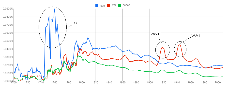
    The Google  Books Ngram Viewer shows the frequency of occurrences of the words over the duration specified (from 1700-2008)  in the various books scanned by Google. This is pretty cool, and one doesnt have to download all the book information and then do a frequency analysis. Also the viewer supports multiple words to be specified and see how they trend over the years.

    I quickly tried checking the trend for the words 'love', 'war' and 'peace' and following is the visualization of the same . You can view the chart and also play around with it(and other words ) with Google Labs Books ngram Viewer here.


    I am not sure what exactly happened during 1740 to 1770; to my limited knowledge 1760s saw Industrial Revolution. The spikes in the word 'war' during 1910s and 1940s correspond to the World Wars raging on then.  Did you notice that 'war' is again trending up and 'love' and 'peace' are going down?

    On a closer look, this looks to me like a direction reversal for 'war' and is it possible that we are going to see some bloodshed soon? Notice, that whenever there has been a direction reversal in the 'war' trend, there has been a war.

    Some more trend here , here , here and here .  Any other interesting words/phrases to be visualized? 

    Mozilla Open Data Visualization Entry-3

    This is my 3rd Entry to the Mozilla Open Data Visualization Competition.
    My 1st entry can be found here.
    My 2nd entry can be found here.

    In this entry , I have to tried to analyse how the age factor affects the usage of three of the features in Firefox 4, namely - Keyboard Shortcuts, Search and the new feature - Panorama. For this analysis, i used the small dataset from "Firefox 4 Beta Interface - Version 2". The following chart presents the data grouped as per the feature and shows the % usage of different age groups.


    Also, I have presented the top 3 often used keyboard shortcuts that are used by different age groups. In this, i have preferred a tabular layout, as i feel that data of this nature is best visualized using a tabular format(it is not necessary that every visualization needs to be presented
    in some bar or pie chart :)).


    The analysis does find that 18-25 and 26-35 age groups are the maximum adopters of the Panorama, Search and Keyboard shortcuts.

    Also, it is observed that 'new tab', back', and 'find' are widely used by the younger audience. The usage of the 'back' and 'new tab' keyboard shortcuts drops as the age of the audience increases.

    December 18, 2010

    Mozilla Open Data Visualization Entry-2

    This is my second entry to the Mozilla Open Data Visualization competition. You can find my earlier entry here.

    This Entry tries to analyse how people spend time on the Web. In this entry too, i have tried to analyse on four fronts. [But these are generic compared to my previous entry - i.e, my previous entry was more w.r.t users and their relationship with Firefox; whereas this Entry is mainly related to the user's general behavior - which were obtained from the Firefox Survey. Nevertheless, this analysis does give some insights into various facets of user-web interaction]

    1) Does the knowledge of Computer or the Web affect the way users visit various websites?


    2) How do people come to know about the latest computer technology and trends?


    3) What is the phone ownership pattern of the users who own a smartphone?


    4) On what kind of websites do people spend their time?


    [I have deliberately avoided explaining the interpretations and understandings - as I believe that the numbers speak for themselves. However, any doubts in the charts can be explained]

    My 1st Entry to this competition can be found here.
    My 3rd Entry to this competition can be found here.

    December 17, 2010

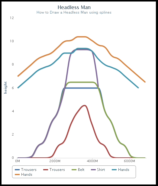
    How to draw a Headless Man using Splines

    Tools Used : HighCharts, some creativity, and loads of patience :)

    India ZIPScribble Maps

    And it so happens that i managed to get a handle on all the zip codes in India and their corresponding longitudes-latitudes. This is what you get when you connect all the zipcodes in India :


    And then when you order the long-lat pairs :


    The next in this series is going to be :
    1) Calculate the total distance travelled when you connect all the zipcodes (from map#1).
    2) Do a TSP(Travelling Salesman Problem) on the zipcodes (from #1 above) and plot the route. Calculate the distance.
    3) Do #2 for each of the states. (this "can" be used when you are planning your travel)

    December 16, 2010

    Mozilla Open Data Visualization Competition

    The following are the results of my analysis of the data from the Mozilla Open Data Visualization Fall 2010 contest. I downloaded witl_small.tar.gz (from "A Week in the Life of a Browser - Version 2" ) which contains a sample of the data for my analysis.

    I did not download the full set as my bandwidth has been crappy for sometime and also was running out of time. (The queries can be run on the FULL data though.) Mozilla has provided many attributes related to the various activities on FF (and there are SO MANY of them!). Since i stumbled on this contest pretty late in the game, i was unable to analyse ALL the attributes/dimensions. I preferred tackling a few questions in good detail than analysing many dimensions without much depth.

    So my analysis consists of the following 4 visualizations which try to answer 4 different questions.

    Tools Used : Protovis, HighCharts, Python, SQLite3 (Excel was used for Preliminary analysis/data cleansing)

    1) What is the Web usage pattern of people of different age groups?
      Or in other words, What is the average number of hours spent by someone who is 30 years old?


    2) Is their a correlation between the number of years being associated with Firefox and the number of hours spent on the Web daily?
    or in otherwords, do people who have used Firefox for 3-5 years or more, spend more number of hours using the Web Daily?


    3) What kind of bookmark activity do people do who are associated with Firefox for a number of years(we analyse *only* those who use any of the bookmark feature)
    i.e, how is the bookmarking creation/choosing/modifying spread among the bookmarking operations?

    (In the above chart, you will find 3-6m column being empty - the reason being, there was no data for this in the sample - i hope that the same is present in the full data set).

    4) How do different age groups function w.r.t various features on the Firefox?
    Note: this chart is to be read vertically - i.e, for a given feature, lets say Private Mode, which is the age group which uses this feature often? You will find that on viewing the column Privatemode, the age group 18-25 has the darkest color, which means that this is the age group which uses the feature often. Hence, the color gradient from the lightest to the darkest encodes the least to most often used.


    [I have deliberately avoided explaining the interpretations and understandings - as I believe that the numbers speak for themselves. However, any doubts in the charts can be explained]

    My 2nd entry to this competition can be found here.
    My 3rd entry to this competition can be found here.

    December 15, 2010

    ChronoDrop - Visualizing Events

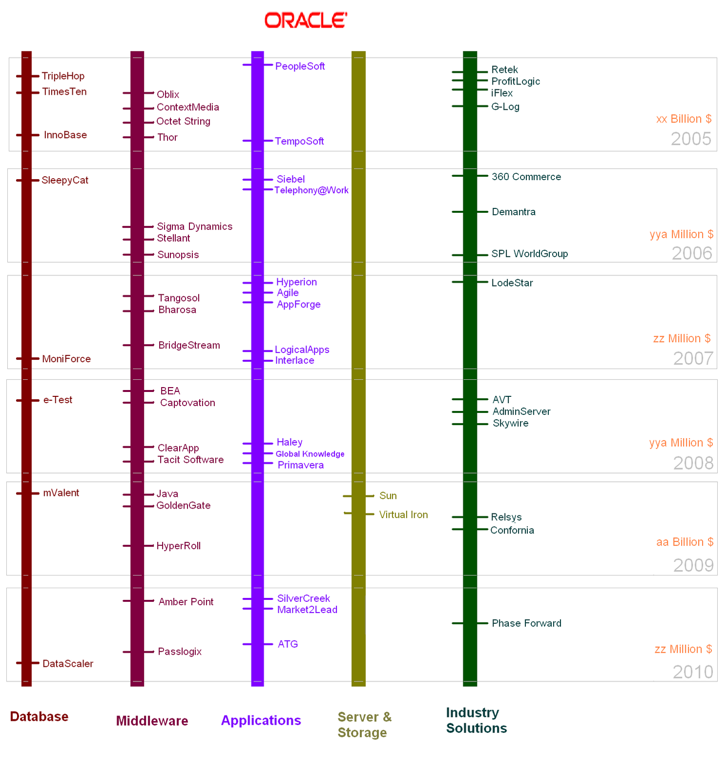
    I always liked Subway Maps - they are easy to understand and also look visually pleasing. And then i stumbled on the following visualization wherein Subway Maps are used to show the Acquisitions that Google had made over the past few years. The graph does look good, and shows the domain of the firm by color coding the 'route'.


    But this graph suffers from a BIG defect : it does not show the 'time' factor; as in, we do not know the sequence in which Google acquired the companies. Also, it does not show the amount shelled out by Google in acquiring each of the firms. And I wanted to rectify this by choosing a better medium.

    I am not a designer and my illustration skills are very limited. Hence i mostly restrain myself to charts and graphs than creating a kicka$$ poster or infographics illustration. But, the problem was very interesting and i thought i would take a dig at this and also see how good I am with some illustration skills.

    I devised ChronoDrop - a visualization technique to group and order events that have an associated time factor. Assumption being, the events do not belong to multiple groups(/domains) and are to be represented in a timeline. So, in this case, a company cannot belong to both Social and Technology - we demarcate the separation in strict terms so that the readability is enhanced.

    In the following illustration, I used ChronoDrop to show the acquisitions that Oracle has done since 2005. The companies are divided based on the domain - like, databases, middleware etc.


    Why did i call it ChronoDrop?
    - Well, 'chronos' personifies time and i wanted this representation to be based on events which are spread across time.
    - And why Drop? I always preferred scrolling down than scrolling horizontally. How many times do we scroll horizontally? In fact, good UI designers despise horizontal scrolling; i have seen numerous instances, wherein presence of a horizontal scrollbar is loathed upon (more than that, horizontal scrolling is just a BIG pain in the a$$).

    Some more modifications could be done to ChronoDrop, like,
    1) making the font of the Company name scale according to the amount spent on acquiring it. I wouldn't prefer logos, as images can cause a quadratic change (also they become quiet inefficient unless/otherwie the graphic is to be printed as a poster).
    2) If animation was possible, then we can show the Date of acquisition(and any other details) when the mouse is hovered over the company name (hyperlinks are always possible). I did not want to display the amount in the 'static' image, as I did not want to clutter the viz.
    3) The amount spent on the acquisition can be shown in the static image, but this requires some illustration skills which i do not readily possess. For eg. If we can increase the image size, then we can easily accomodate the cost factor beneath the organization name.

    Something that i liked about ChronoDrop is that, this graph can be generated programmically pretty easily. I hope to generate a library for this sometime.

    Well, i do not think ChronoDrop is a game changing technique/representation in the visualization field, but this my FIRST attempt at designing/conceptualizing a medium in this arena.

    Probably, some more useful illustrations of ChronoDrop :
    - IMDB's top 250 movies based on genre grouped by release dates.
    - Comparing the tenures of the US Presidents with that of Indian Prime Minsters; scams during the respective tenures could be interspersed.
    - Sporting events(cricket, football, hockey, archery, tennis, badminton) over decades
    - Various Natural Calamities(Earthquakes, Typhoons, Floods/Landslides, Volcanos) over decades.

    Around the World in 14 Hops

    "Boredom leads to inspiration". One uneventless bored noon is enough to do anything - and i went world hopping; and it takes only 14 hops - with one of them being tracing the same route(9,10).


    Just if you missed noticing, the above map appears on Facebook login page.

    December 14, 2010

    Scribble Map

    I was looking for possible visualizations using maps on the Internet; thinking as to how people would be using lat/long details to present information. One obvious example would be use maps to show the sales/revenue spread across the various LoBs of an organization. Many enterprises capture the spatial information and display along with the 'regular' data(sales/revenue..etc etc). By the way, spatial maps, however simple they might sound are very important to bring a breath of fresh air into an otherwise uninspiring presentation of Enterprise data - you no longer work with tables, but directly on the map-region wherein the action is taking place.

    But was there more that can be done with maps? Anything more funny and hackworthy? And then i stumbled on ZIPScribbleMaps - i found this extremely interesting; especially for a country like India which is huge and diverse, some visualization w.r.t Pin codes (or Zip codes) would be neat.

    I quickly searched the web for a complete list of India Pin Codes, but it was quiet funny that i was not able to find it anywhere. You have to pay to get this information - especially if you want the zipcodes along with the lat/long information. (I think Govt should opensource this).

    The following shows the ZIPScribble map for the state of Andhra Pradesh (I will do this for the rest of the Indian States soon - probably this weekend).I used the Google Maps API v2 and plotted the polylines between the pin codes, and this is what you have :

    The first map shows the scribble, when all the pincodes are arranged in ascending order and lines are drawn between two consecutive postal codes.


    The Second map shows the scribble, when we remove the duplicate lat-long pair and arrange them in ascending order (So that a PIN is not repeated).

    December 13, 2010

    Hollywood movies Visualization -Trilogy Meter

    Spent some time scraping the data from IMDB - ended up manually scraping the data for the 10 movie trilogies that I always liked. This was more of a personal project as in I wanted to see how trilogies fared - in terms of budget, revenues and the final ratings that the users provide. The rating shown is the rating of that particular part of the trilogy on 12-Dec-2011 from IMDB.
    Each of the bars in each of the graphs of Budget,Ratings and Gross Revenue denote a part of the respective trilogy, with the leftmost bar being part 1, mid being part 2 and the right bar being part 3.

    December 12, 2010

    December 10, 2010

    World's Billionaires Visualization

    I always wanted to be RICH (just like everyone else) :)
    There are 1101 Billionaires in the World in the year 2010 as released by Forbes Magazine. Now, I have the data and some interesting patterns can be deciphered. Some visualizations from the data set.

    Spread of Billionaires across Age Groups:


    Spread of Billionaires across Countries would be a usual visualization. So here is a quick heatmap of the same. I used openheatmap to create this - i would have ideally preferred that i am able to choose the colors so that the gradients are more pronounced and show the spread (but alas!). You can also interact with this map in here.


    The Forbes list also gives the details of the Citizenship and the Residence of the Billionaires. This data can be used to find out the pattern here; i.e, find out the billionaires whos Country of Citizenship is not the same as Country of Residence; or try to find out how the countries of Residence and Citizenship correlate; which is the thickest arc in the data which links two countries? (though i would have preferred that clicking on the arc leads shows some useful tooltip, but i was not able to find that option in Protovis).


    Also, some interesting facts came out of the data:
    • There are 8 'couples' - as in, set of 2 persons whose combined assets touch 1billion or more.
    • Of the 1101 names, there are 105Families; the total asset value of these 105 Families is 2990.4 Billion $. Top 3 countries having the rich families : US(25), China (9), India (7).
    • The combined wealth of all the Billionaires is close to 3567.8 Billion $.
    • Top 5 Countries measured in terms of the highest net worth of the Billionaires: USA(1349.3), Russia(265), India (222.1), Germany(217.7), China(133.2). (Again, this data can be showed as a heat/choropleth map, but i did not want to overdo on this viz). 
    • One more interesting observation would be to find out how age and the wealth work together. So, i quickly divided age by wealth to find out the most 'successful' - 'Success' here is defined as those whose age/wealth factor is as close to 1. And i found that top 5 on this race are :
    1.    William Gates III (Rank:2, Age:54, Worth:53, Success Factor:1.0)
    2.    Carlos Slim Helu & family (Rank:1, Age:70, Worth:53.5, Success Factor:1.3)
    3.    Warren Buffett (Rank:3, Age:79, Worth:47, Success Factor:1.7)
    4.    Mukesh Ambani (Rank:4, Age:52, Worth:29, Success Factor:1.8)
    5.    Eike Batista (Rank:8, Age:53, Worth:27, Success Factor:2.0)

    The following visualization was more of a fun factor. It shows the tag cloud of the names of all the Billionaires in the world. The font size shows how frequent some of those names occur.

    December 07, 2010

    Data Visualization Fail # 2


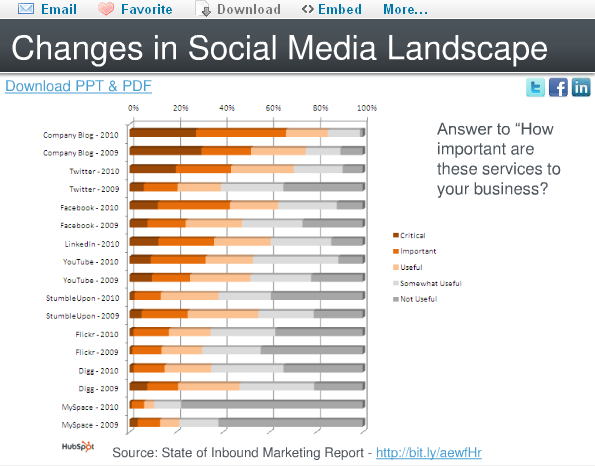
    In the following set of charts i have tried to highlight some 'pain' points and also suggest how these charts can be made more attractive without sacrificing the 'data quality'. All the charts were obtained from the presentation present here.   I stumbled on this presentation at Slide Share which has a few marketing charts, and i think i can use this to present some of the visualization gotchas or chartjunk.
    Again, the idea is not to criticize the author of these charts but valuable suggestions on how to make 'beautiful' presentations from the same set of data. Due to lack of time, i am not able to generate the equivalent 'beautiful' charts, but would definitely present the suggestions.

    Chart 1: 
    a)  Background grid lines can be removed
    b)  Since the value associated with the bar is already displayed at the top of the bar, i wouldnt necessarily be having a Y-axis.
    c) I would prefer a Tufte Graph for this - makes more sense as the number of bars are less.
    d) The color chosen is good and also the axis descriptions are neat.


    Chart 2:
    a) Though there are only two pie charts being used here, and each of them has only 3 regions, we might think that probably it fits the use-case here, but i feel a set of histograms or line graph would  make this even beautiful.
    b) I would always suggest a Tufte Graph when the number of regions is very less and there are not many dimensions to be considered.
    (There is nothing 'criminally' wrong in using pie chart here)


    Chart 3:
    a) Two pie charts  with many regions!!!
    b) Color chosen are not good.
    c) Colors do not show the intention - on the first glace it looks to me that Direct Mail, Trade Shows and Telemarketing are to be clubbed together and so be "Email Marketing" and "Other" & PPC and SEO - i think this is a strict NO-NO.
    d) Prefer a simple bar graph.
    e) Also there a BIG chart ERROR : In the 2009 graph, we see Blogs and Social media in ONE pie which comprises 9% whereas in 2010 graph, these two are divided  into two pies. ~dumph~


    Chart 4:
    a) The hort.stacked bar chart is an overkill here.
    b) Tough to read
    c) The % scale on the hort axis does not make sense to me. Would have preferred the number to be present in each of the 'pieces' of the bar.


    Chart 5:

    a) Date Format - me being from the Indian Subcontinent, i always have a trouble when date format is given to me in xx/xx/yyyy format - i am not sure whether the first xx is a month or date. I always prefer the dd-mmm-yyyy or dd-mmm'yy format. In this kind of a graph, where growth rate is to be shown, mmm-yy would have been perfect.
    b) Rather than chosing the Growth Rate, i would preferred the number of active users on the Y-axis. This is a small nit.
    c) Clustering on a Q-on-Q basis would also have been better.