In the following set of charts i have tried to highlight some 'pain' points and also suggest how these charts can be made more attractive without sacrificing the 'data quality'. All the charts were obtained from the presentation present here. I stumbled on this presentation at Slide Share which has a few marketing charts, and i think i can use this to present some of the visualization gotchas or chartjunk.
Again, the idea is not to criticize the author of these charts but valuable suggestions on how to make 'beautiful' presentations from the same set of data. Due to lack of time, i am not able to generate the equivalent 'beautiful' charts, but would definitely present the suggestions.
Chart 1:
a) Background grid lines can be removed
b) Since the value associated with the bar is already displayed at the top of the bar, i wouldnt necessarily be having a Y-axis.
c) I would prefer a Tufte Graph for this - makes more sense as the number of bars are less.
d) The color chosen is good and also the axis descriptions are neat.

Chart 2:
a) Though there are only two pie charts being used here, and each of them has only 3 regions, we might think that probably it fits the use-case here, but i feel a set of histograms or line graph would make this even beautiful.
b) I would always suggest a Tufte Graph when the number of regions is very less and there are not many dimensions to be considered.
(There is nothing 'criminally' wrong in using pie chart here)

Chart 3:
a) Two pie charts with many regions!!!
b) Color chosen are not good.
c) Colors do not show the intention - on the first glace it looks to me that Direct Mail, Trade Shows and Telemarketing are to be clubbed together and so be "Email Marketing" and "Other" & PPC and SEO - i think this is a strict NO-NO.
d) Prefer a simple bar graph.
e) Also there a BIG chart ERROR : In the 2009 graph, we see Blogs and Social media in ONE pie which comprises 9% whereas in 2010 graph, these two are divided into two pies. ~dumph~

Chart 4:
a) The hort.stacked bar chart is an overkill here.
b) Tough to read
c) The % scale on the hort axis does not make sense to me. Would have preferred the number to be present in each of the 'pieces' of the bar.
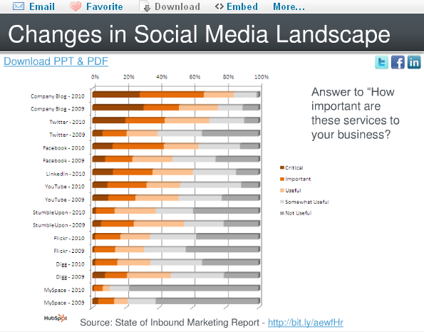
Chart 5:
a) Date Format - me being from the Indian Subcontinent, i always have a trouble when date format is given to me in xx/xx/yyyy format - i am not sure whether the first xx is a month or date. I always prefer the dd-mmm-yyyy or dd-mmm'yy format. In this kind of a graph, where growth rate is to be shown, mmm-yy would have been perfect.
b) Rather than chosing the Growth Rate, i would preferred the number of active users on the Y-axis. This is a small nit.
c) Clustering on a Q-on-Q basis would also have been better.

No comments:
Post a Comment